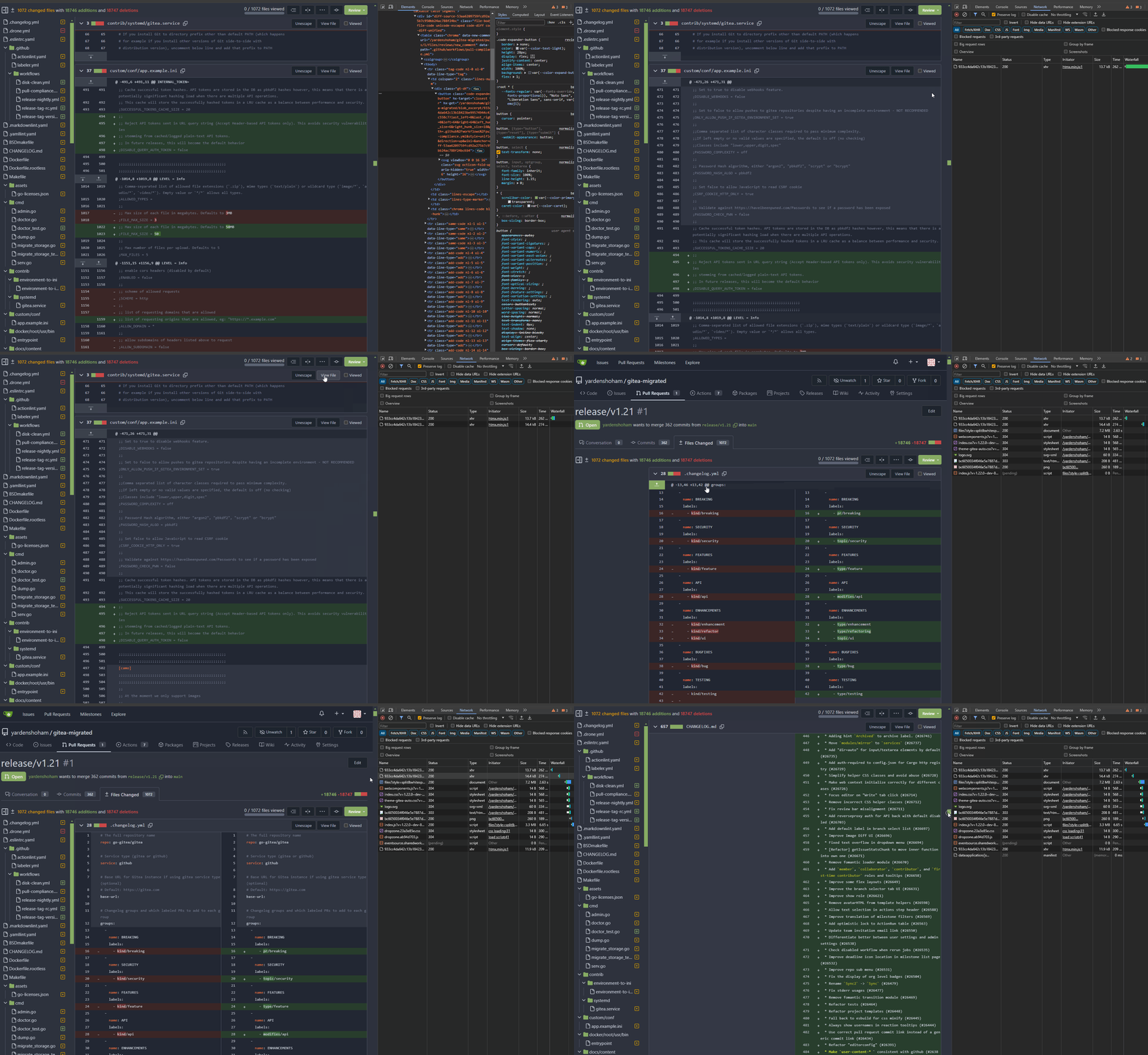
- Removed all jQuery AJAX calls and replaced with htmx
- Tested the code diff expansion buttons functionality and it works as
before plus a loading indicator
# Demo using `htmx` instead of jQuery AJAX
Signed-off-by: Yarden Shoham <git@yardenshoham.com>
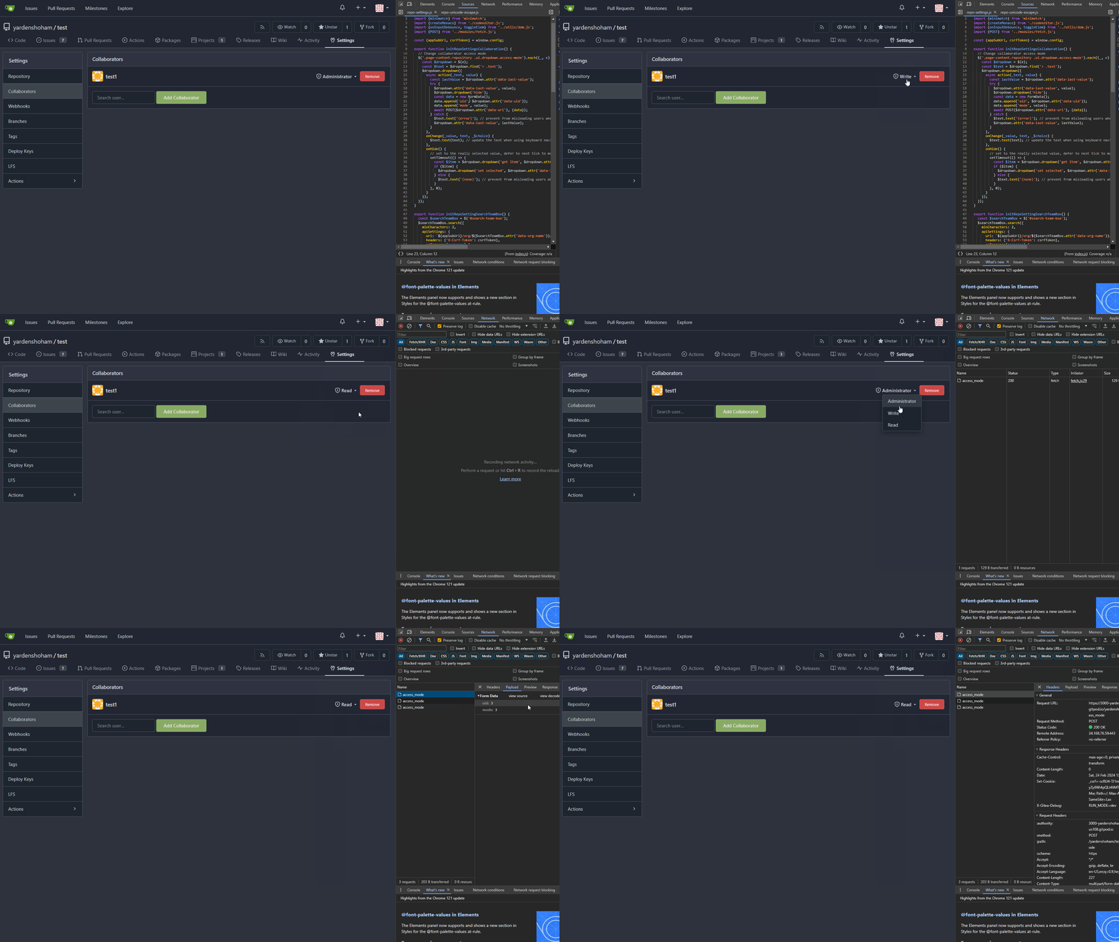
- Removed all jQuery AJAX calls and replaced with our fetch wrapper
- Tested the repo collaborator mode dropdown functionality and it works
as before
# Demo using `fetch` instead of jQuery AJAX

Signed-off-by: Yarden Shoham <git@yardenshoham.com>
Co-authored-by: Giteabot <teabot@gitea.io>
- Removed all jQuery AJAX calls and replaced with our fetch wrapper
- Tested the repo collaborator mode dropdown functionality and it works
as before
# Demo using `fetch` instead of jQuery AJAX
---------
Signed-off-by: Yarden Shoham <git@yardenshoham.com>
Co-authored-by: delvh <dev.lh@web.de>
Co-authored-by: Giteabot <teabot@gitea.io>
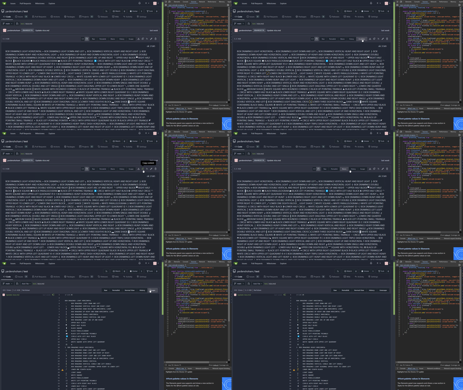
- Switched to plain JavaScript
- Tested the Unicode escape button functionality and it works as before
# Demo using JavaScript without jQuery
---------
Signed-off-by: Yarden Shoham <git@yardenshoham.com>
Co-authored-by: wxiaoguang <wxiaoguang@gmail.com>
This is the implementation of Recent Commits page. This feature was
mentioned on #18262.

It adds another tab to Activity page called Recent Commits. Recent
Commits tab shows number of commits since last year for the repository.
### Overview
This is the implementation of Code Frequency page. This feature was
mentioned on these issues: #18262, #7392.


It adds another tab to Activity page called Code Frequency. Code
Frequency tab shows additions and deletions over time since the
repository existed.


Before:
<img width="1296" alt="image"
src="https://github.com/go-gitea/gitea/assets/32161460/2603504f-aee7-4929-a8c4-fb3412a7a0f6">

After:
<img width="1296" alt="image"
src="https://github.com/go-gitea/gitea/assets/32161460/58c03721-729f-4536-a663-9f337f240963">

---


#### Features
- See additions deletions over time since repository existed
- Click on "Additions" or "Deletions" legend to show only one type of
contribution
- Use the same cache from Contributors page so that the loading of data
will be fast once it is cached by visiting either one of the pages

---------

Co-authored-by: Giteabot <teabot@gitea.io>
- Use case in `repo-commit` was tested until the point where the POST
request was sent with the same payload.
- Use case in `repo-legacy` was tested completely with comment editing.
- `jquery/no-fade` was disabled as well to stay in sync with
`no-jquery/no-fade`, had no violations.
- Switched to plain JavaScript
- Tested the wiki creation form functionality and it works as before
# Demo using JavaScript without jQuery

---------
Signed-off-by: Yarden Shoham <git@yardenshoham.com>
Co-authored-by: silverwind <me@silverwind.io>
- Switched to plain JavaScript
- Tested the repo migration form functionality and it works as before
# Demo using JavaScript without jQuery

---------
Signed-off-by: Yarden Shoham <git@yardenshoham.com>
Co-authored-by: silverwind <me@silverwind.io>
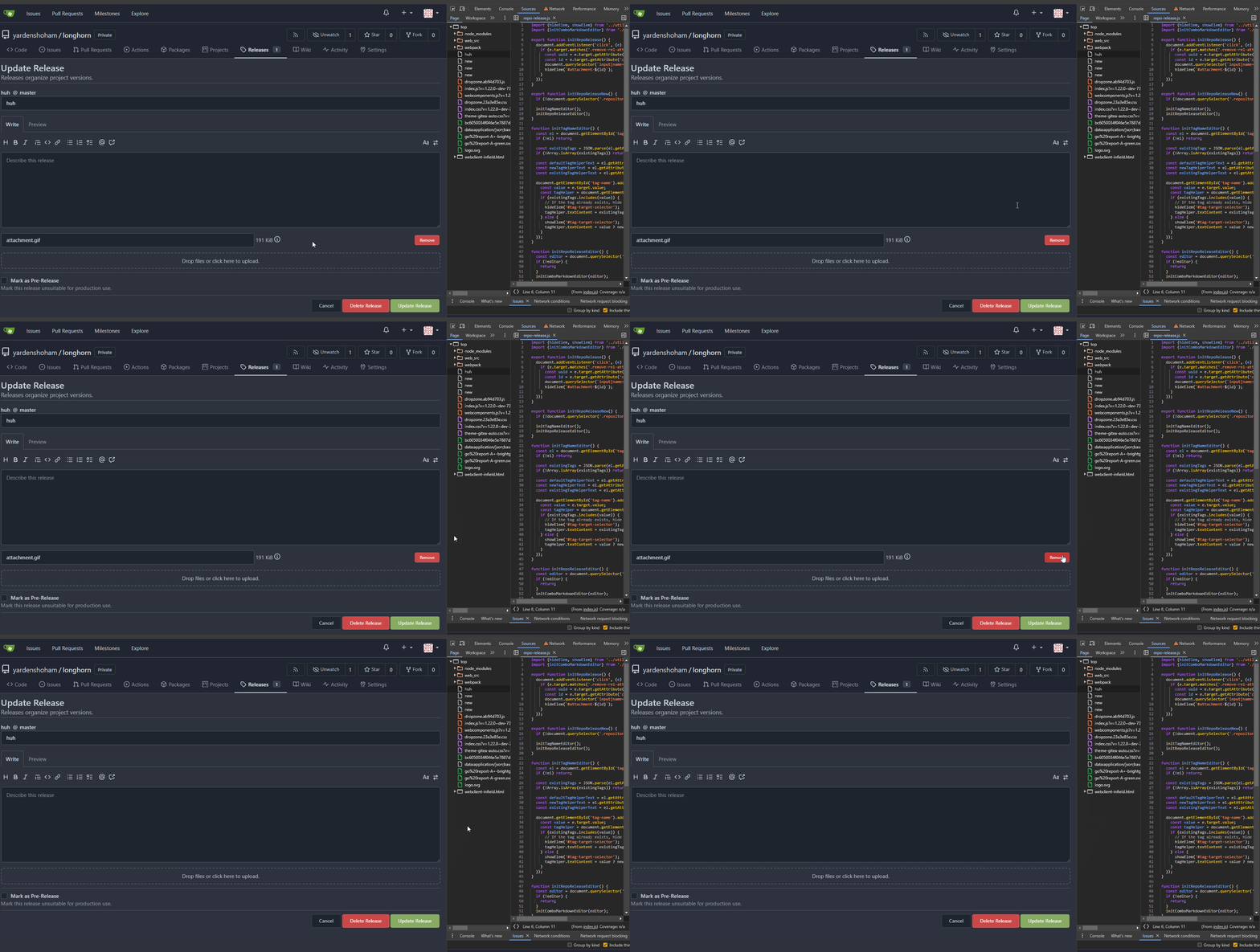
- Switched to plain JavaScript
- Tested the repo release form functionality and it works as before
# Demo using JavaScript without jQuery
---------
Signed-off-by: Yarden Shoham <git@yardenshoham.com>
Co-authored-by: wxiaoguang <wxiaoguang@gmail.com>
- Switched to plain JavaScript
- Tested the webhook editing functionality and it works as before
# Demo using JavaScript without jQuery

---------
Signed-off-by: Yarden Shoham <git@yardenshoham.com>
Co-authored-by: wxiaoguang <wxiaoguang@gmail.com>
- Switched to plain JavaScript
- Tested the organization rename prompt toggling functionality and it
works as before
# Demo using JavaScript without jQuery

---------
Signed-off-by: Yarden Shoham <git@yardenshoham.com>
Co-authored-by: silverwind <me@silverwind.io>
Continuation of https://github.com/go-gitea/gitea/pull/25439. Fixes#847
Before:
<img width="1296" alt="image"
src="https://github.com/go-gitea/gitea/assets/32161460/24571ac8-b254-43c9-b178-97340f0dc8a9">
----
After:
<img width="1296" alt="image"
src="https://github.com/go-gitea/gitea/assets/32161460/c60b2459-9d10-4d42-8d83-d5ef0f45bf94">
---
#### Overview
This is the implementation of a requested feature: Contributors graph
(#847)
It makes Activity page a multi-tab page and adds a new tab called
Contributors. Contributors tab shows the contribution graphs over time
since the repository existed. It also shows per user contribution graphs
for top 100 contributors. Top 100 is calculated based on the selected
contribution type (commits, additions or deletions).
---
#### Demo
(The demo is a bit old but still a good example to show off the main
features)
<video src="https://github.com/go-gitea/gitea/assets/32161460/9f68103f-8145-4cc2-94bc-5546daae7014" controls width="320" height="240">
<a href="https://github.com/go-gitea/gitea/assets/32161460/9f68103f-8145-4cc2-94bc-5546daae7014">Download</a>
</video>
#### Features:
- Select contribution type (commits, additions or deletions)
- See overall and per user contribution graphs for the selected
contribution type
- Zoom and pan on graphs to see them in detail
- See top 100 contributors based on the selected contribution type and
selected time range
- Go directly to users' profile by clicking their name if they are
registered gitea users
- Cache the results so that when the same repository is visited again
fetching data will be faster
---------
Co-authored-by: silverwind <me@silverwind.io>
Co-authored-by: hiifong <i@hiif.ong>
Co-authored-by: delvh <dev.lh@web.de>
Co-authored-by: 6543 <6543@obermui.de>
Co-authored-by: yp05327 <576951401@qq.com>
- Switched to plain JavaScript
- Tested the form and it works as before

---------

Signed-off-by: Yarden Shoham <git@yardenshoham.com>
Co-authored-by: wxiaoguang <wxiaoguang@gmail.com>
- Closes https://github.com/go-gitea/gitea/issues/28880
This change introduces htmx with the hope we could use it to make Gitea
more reactive while keeping our "HTML rendered on the server" approach.
- Add `htmx.js` that imports `htmx.org` and initializes error toasts
- Place `hx-headers='{"x-csrf-token": "{{.CsrfToken}}"}'` on the
`<body>` tag so every request that htmx sends is authenticated
- Place `hx-swap="outerHTML"` on the `<body>` tag so the response of
each htmx request replaces the tag it targets (as opposed to its inner
content)
- Place `hx-push-url="false"` on the `<body>` tag so no changes to the
URL happen in `<form>` tags
- Add the `is-loading` class during request
### Error toasts in action

## Don't do a full page load when clicking the subscribe button
- Refactor the form around the subscribe button into its own template
- Use htmx to perform the form submission
- `hx-boost="true"` to prevent the default form submission behavior of a
full page load
- `hx-sync="this:replace"` to replace the current request (in case the
button is clicked again before the response is returned)
- `hx-target="this"` to replace the form tag with the new form tag
- Change the backend response to return a `<form>` tag instead of a
redirect to the issue page
### Before
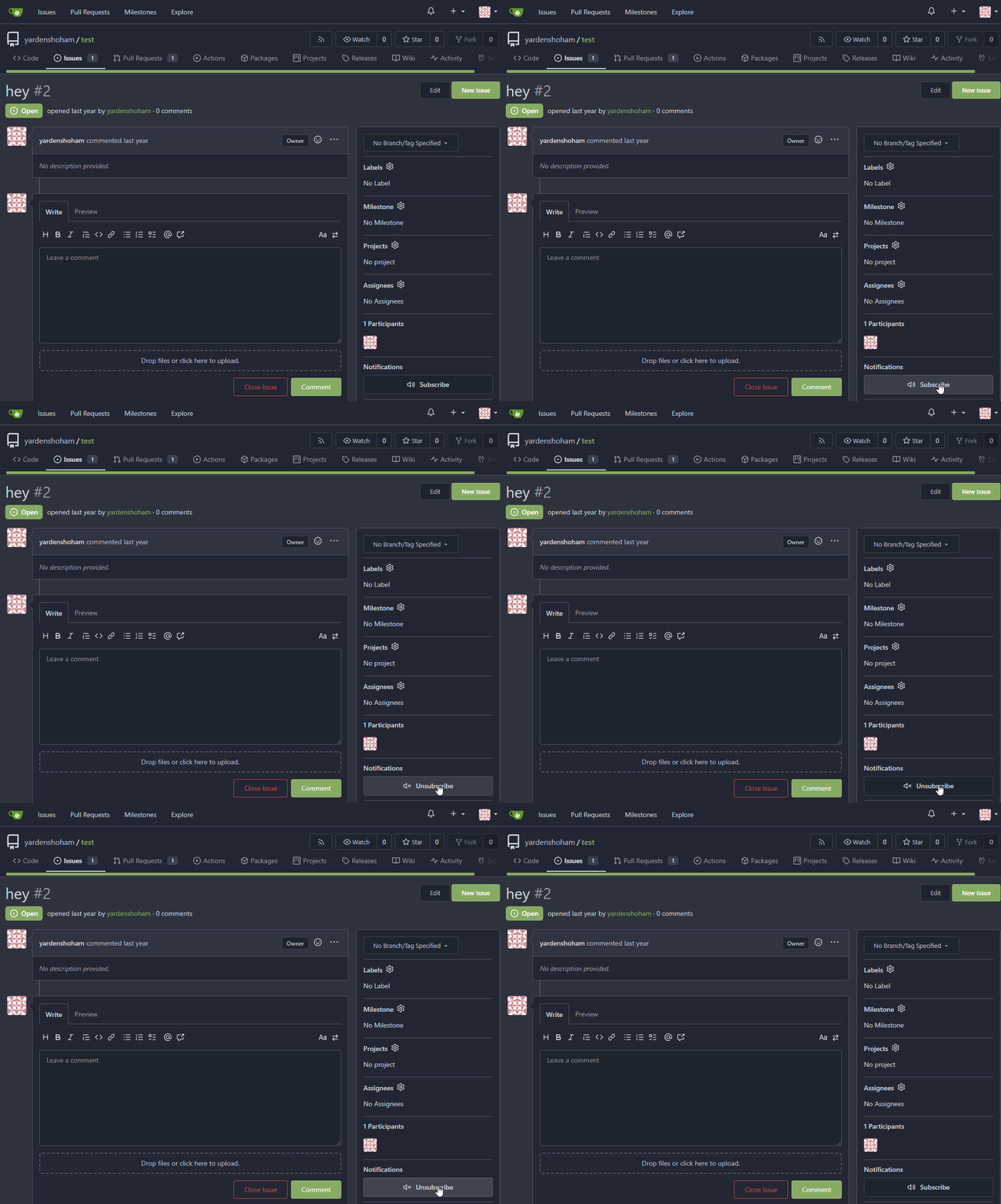
### After

## Don't do a full page load when clicking the follow button
- Use htmx to perform the button request
- `hx-post="{{.ContextUser.HomeLink}}?action=follow"` to send a POST
request to follow the user
- `hx-target="#profile-avatar-card"` to target the card div for
replacement
- `hx-indicator="#profile-avatar-card"` to place the loading indicator
on the card
- Change the backend response to return a `<div>` tag (the card) instead
of a redirect to the user page
### Before
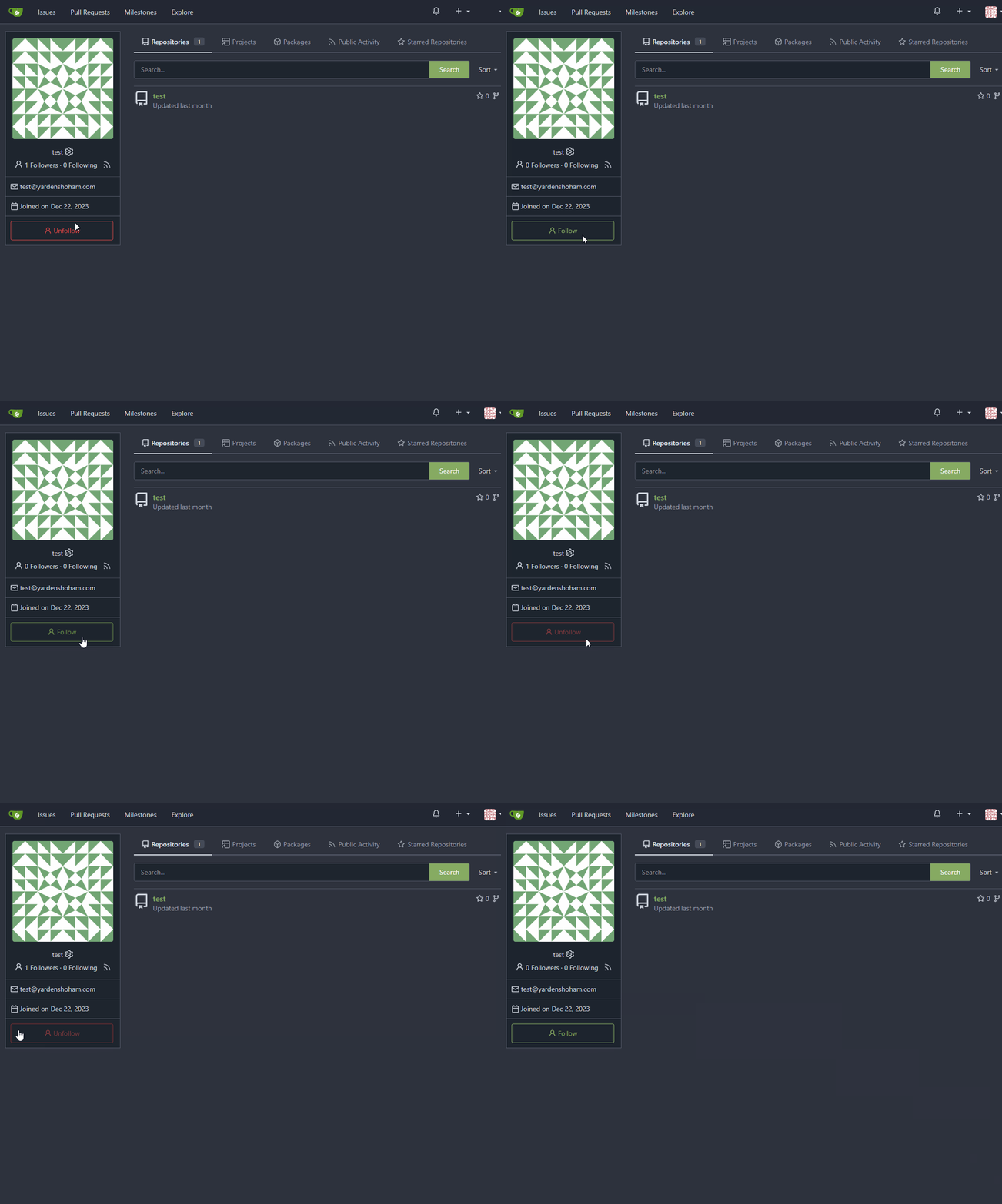
### After

---------
Signed-off-by: Yarden Shoham <git@yardenshoham.com>
Co-authored-by: 6543 <m.huber@kithara.com>
Co-authored-by: Giteabot <teabot@gitea.io>
The `ToUTF8*` functions were stripping BOM, while BOM is actually valid
in UTF8, so the stripping must be optional depending on use case. This
does:

- Add a options struct to all `ToUTF8*` functions, that by default will
strip BOM to preserve existing behaviour
- Remove `ToUTF8` function, it was dead code
- Rename `ToUTF8WithErr` to `ToUTF8`
- Preserve BOM in Monaco Editor
- Remove a unnecessary newline in the textarea value. Browsers did
ignore it, it seems but it's better not to rely on this behaviour.

Fixes: https://github.com/go-gitea/gitea/issues/28743
Related: https://github.com/go-gitea/gitea/issues/6716 which seems to
have once introduced a mechanism that strips and re-adds the BOM, but
from what I can tell, this mechanism was removed at some point after
that PR.
- Refactor the form around the subscribe button into its own template
- Use htmx to perform the form submission
- `hx-boost="true"` to prevent the default form submission behavior of a
full page load
- `hx-sync="this:replace"` to replace the current request (in case the
button is clicked again before the response is returned)
- `hx-target="this"` to replace the form tag with the new form tag
- `hx-push-url="false"` to disable a change to the URL
- `hx-swap="show:no-scroll"` to preserve the scroll position
- Change the backend response to return a `<form>` tag instead of a
redirect to the issue page
- Include `htmx.org` in javascript imports
This change introduces htmx with the hope we could use it to make Gitea
more reactive while keeping our "HTML rendered on the server" approach.
# Before

# After

---------
Signed-off-by: Yarden Shoham <git@yardenshoham.com>
Fixes#27114.
* In Gitea 1.12 (#9532), a "dismiss stale approvals" branch protection
setting was introduced, for ignoring stale reviews when verifying the
approval count of a pull request.
* In Gitea 1.14 (#12674), the "dismiss review" feature was added.
* This caused confusion with users (#25858), as "dismiss" now means 2
different things.
* In Gitea 1.20 (#25882), the behavior of the "dismiss stale approvals"
branch protection was modified to actually dismiss the stale review.
For some users this new behavior of dismissing the stale reviews is not
desirable.
So this PR reintroduces the old behavior as a new "ignore stale
approvals" branch protection setting.
---------
Co-authored-by: delvh <dev.lh@web.de>
Gitea prefers to use relative URLs in code (to make multiple domain work
for some users)

So it needs to use `toAbsoluteUrl` to generate a full URL when click
"Reference in New Issues"

And add some comments in the test code
- When crafting the OAuth2 callbackURL take into account `appSubUrl`,
which is quite safe given that its strictly formatted.
- No integration testing as this is all done in Javascript.
- Resolves https://codeberg.org/forgejo/forgejo/issues/1795

(cherry picked from commit 27cb6b7956136f87aa78067d9adb5a4c4ce28a24)

Co-authored-by: Gusted <postmaster@gusted.xyz>
When the form is going to be submitted, add the "is-loading" class to
show an indicator and avoid user UI events.

When the request finishes (success / error), remove the "is-loading"
class to make user can interact the UI.
When hitting the `enter` key to create a new project column, the request
is sent twice because the `submit` event and `key up` event are both
triggered.
Probably a better solution is to rewrite these parts of the code to
avoid using native jQuery but reuse the `form-fetch-action` class. But
it's beyond my ability.
1. Do not show temporary tooltips that are triggered from within
dropdowns. Previously this resulted in the tooltip being stuck to
top-left of the page like seen on issue comment URL copy. I could not
figure out any tippy options that prevent this, so I think it's better
to just not show it.
1. Refactor `initGlobalCopyToClipboardListener` so that it does not run
a often useless `document.querySelector` on every click, make
`data-clipboard-text-type` work with `data-clipboard-target`. No use in
current code base but still good to have. Finally some minor code
cleanup in the function.

Point 1 is for this copy button:

<img width="229" alt="image"
src="https://github.com/go-gitea/gitea/assets/115237/81f34746-8ea5-43d9-8c6f-f6f417a9e4ad">

---------

Co-authored-by: Giteabot <teabot@gitea.io>
1. Dropzone attachment removal, pretty simple replacement
2. Image diff: The previous code fetched every image twice, once via
`img[src]` and once via `$.ajax`. Now it's only fetched once and a
second time only when necessary. The image diff code was partially
rewritten.

---------

Co-authored-by: Giteabot <teabot@gitea.io>
- Update all JS and PY dependencies
- Enable eslint `prefer-object-has-own` and autofix issue
- Fix styling on citation buttons
- Tested citation, mermaid, monaco, swagger, katex

Citation button issue was that these buttons were not filled:

<img width="136" alt="Screenshot 2023-10-07 at 14 05 08"
src="https://github.com/go-gitea/gitea/assets/115237/435f0c91-28ac-46b3-bae4-dad768b29c05">

Co-authored-by: techknowlogick <techknowlogick@gitea.com>
This PR reduces the complexity of the system setting system.

It only needs one line to introduce a new option, and the option can be
used anywhere out-of-box.

It is still high-performant (and more performant) because the config
values are cached in the config system.
Fixes https://github.com/go-gitea/gitea/issues/27136.

This does the following for Monaco's EOL setting:

1. Use editorconfig setting if present
2. Use the file's dominant line ending as detected by monaco, which uses
LF for empty file
WIP because:

- [x] Some calls set a `content-type` but send no body, can likely
remove the header
- [x] Need to check whether `charset=utf-8` has any significance on the
webauthn calls, I assume not as it is the default for json content.
- [x] Maybe `no-restricted-globals` is better for eslint, but will
require a lot of duplication in the yaml or moving eslint config to a
`.js` extension.
- [x] Maybe export `request` as `fetch`, shadowing the global.
Before:

* The layout is quite complex
* The UI flickers when switch the stats (https://try.gitea.io/)

After:

* Simplify the code
* The UI doesn't flicker
1. Use `gt-invisible` instead of `invisible`.
2. Use `gt-word-break` instead of `dont-break-out` (there is a slight
different "hyphens", but I think it won't affect too much since it is
only used for the "full name").
3. Remove `.small.button:has(svg)` , now our buttons could layout SVG
correctly, and actually I didn't see this CSS class is used in code.
Focus the editor when clicking the "Write" tab. Works for both Textarea
and EasyMDE. Does for some reason not work without the
`requestAnimationFrame`.
The "btn-octicon is-loading" was introduced by #21842 , it is only used
by the "Copy Content" button, but the "btn-octicon" selector would
affect too many uncertain elements.

Now there is a general "small-loading-icon" class, so the "btn-octicon
is-loading" could be removed.
1. Use `is-loading` instead of `ui loader`
2. Introduce class name `image-diff-tabs`, instead of searching `gt-hidden`, which is fragile
3. Align the UI elements, see the screenshots.
Now Gitea exposes unhandled promise rejection messages as error message on the UI.

The "comment form" was quite unclear before, so it should be handled more gracefully to avoid such error.
In GitHub, we can not rerun jobs if the workflow is disabled.

---------

Co-authored-by: silverwind <me@silverwind.io>
Co-authored-by: wxiaoguang <wxiaoguang@gmail.com>
## Archived labels
This adds the structure to allow for archived labels.
Archived labels are, just like closed milestones or projects, a medium to hide information without deleting it.
It is especially useful if there are outdated labels that should no longer be used without deleting the label entirely.
## Changes
1. UI and API have been equipped with the support to mark a label as archived
2. The time when a label has been archived will be stored in the DB
## Outsourced for the future
There's no special handling for archived labels at the moment.
This will be done in the future.
## Screenshots


Part of https://github.com/go-gitea/gitea/issues/25237
---------
Co-authored-by: delvh <dev.lh@web.de>
Co-authored-by: wxiaoguang <wxiaoguang@gmail.com>
This PR refactors a bunch of projects-related code, mostly the
templates.
The following things were done:
- rename boards to columns in frontend code
- use the new `ctx.Locale.Tr` method
- cleanup template, remove useless newlines, classes, comments
- merge org-/user and repo level project template together
- move "new column" button into project toolbar
- move issue card (shared by projects and pinned issues) to shared
template, remove useless duplicated styles
- add search function to projects (to make the layout more similar to
milestones list where it is inherited from 😆)
- maybe more changes I forgot I've done 😆Closes#24893
After:


---------
Co-authored-by: silverwind <me@silverwind.io>
Resizing the comment editor can be a very expensive operation because it
triggers page reflows, which on large PRs can take upwards of seconds to
complete. Disable this mechanism on the diff page only where we know
that the page can get large.

Fixes https://github.com/go-gitea/gitea/issues/26201 for the textarea
editor.

I don't think this can be fixed for EasyMDE because as far as I can
tell, it exposes no option to disable this resizing.

---------

Co-authored-by: Giteabot <teabot@gitea.io>
Previously, `sortablejs` was imported twice, once synchronously and once
asynchronously, leading to webpack creating duplicate output code (once
in the index bundle, and once in a separate chunk). Fix this by always
asynchronously importing it. This was one of the build warnings observed
when trying to build with vite.
Fix#25627
1. `ctx.Data["Link"]` should use relative URL but not AppURL
2. The `data-params` is incorrect because it doesn't contain "page". JS
can simply use "window.location.search" to construct the AJAX URL
3. The `data-xxx` and `id` in notification_subscriptions.tmpl were
copied&pasted, they don't have affect.
Monaco can not deal with color formats other than 6-digit hex, so we
convert the colors for it via new
[`tinycolor2`](https://github.com/bgrins/TinyColor) dependency (5kB
minzipped).

Also, with the addition of the module, we can replace the existing
`hexToRGBColor` usage, I verified it is compatible with the current
tests before removing the function.

Fixes: https://github.com/go-gitea/gitea/issues/25770
Close#20976Close#20975
1. Fix the bug: the TOC in footer was incorrectly rendered as main
content's TOC
2. Fix the layout: on mobile, the TOC is put above the main content,
while the sidebar is put below the main content
3. Auto collapse the TOC on mobile
ps: many styles of "wiki.css" are moved from old css files, so leave
nits to following PRs.
Fix  #25438

All non-"ok" buttons which do not have "type" should not submit the
form, should not be triggered by "Enter".

Co-authored-by: silverwind <me@silverwind.io>
Co-authored-by: Giteabot <teabot@gitea.io>
A regression of #25210

The `e.target` is not "this", eg: `<button link-action><svg></button>`,
then `this` should be `button` but `e.target` is `svg`.

I will propose a clearer and complete solution for these "link-action"
"show-modal" elements after #24724

Co-authored-by: Giteabot <teabot@gitea.io>
- Update all JS dependencies
- Enable stylint
[`media-feature-name-value-no-unknown`](https://stylelint.io/user-guide/rules/media-feature-name-value-no-unknown)
- Make use of new features in webpack and text-expander-element
- Tested Swagger and Mermaid

To explain the `text-expander-element` change: Before this version, the
element added a unavoidable space after emoji completion. Now that
https://github.com/github/text-expander-element/pull/36 is in, we gain
control over this space and I opted to remove it for emoji completion
and retain it for `@` mentions.

---------

Co-authored-by: Giteabot <teabot@gitea.io>
Clarify the "link-action" behavior:

>  // A "link-action" can post AJAX request to its "data-url"
> // Then the browser is redirect to: the "redirect" in response, or
"data-redirect" attribute, or current URL by reloading.

And enhance the "link-action" to support showing a modal dialog for
confirm. A similar general approach could also help PRs like
https://github.com/go-gitea/gitea/pull/22344#discussion_r1062883436

> // If the "link-action" has "data-modal-confirm(-html)" attribute, a
confirm modal dialog will be shown before taking action.


And a lot of duplicate code can be removed now. A good framework design
can help to avoid code copying&pasting.

---------

Co-authored-by: silverwind <me@silverwind.io>
According to my test, the UI (emoji) is fine in Safari

And actually the code is just dead code, because the "resize" event is
never fired on page loading. So for most cases users just view the pages
without this hacky patch, nobody ever complains.
Fixes https://github.com/go-gitea/gitea/issues/25130

The old code uses `$(this).next()` to get `dismiss-review-modal`.
At first, it will get `$(#dismiss-review-modal)`, but the next time it
will get `$(#dismiss-review-modal).next();`
and then `$(#dismiss-review-modal).next().next();`.
Because div `dismiss-review-modal` will be removed when
`dismiss-review-btn` clicked.

Maybe the right usage is adding `show-modal` class and `data-modal`
attribute.
Follow:
* #22697
There are some bugs in #22697:
* https://github.com/go-gitea/gitea/pull/22697#issuecomment-1577957966
* the webauthn failure message is never shown and causes console error
* The `document.getElementById('register-button')` and
`document.getElementById('login-button')` is wrong
* there is no such element in code
* it causes JS error when a browser doesn't provide webauthn
* the end user can't see the real error message
These bugs are fixed in this PR.
Other changes:
* Use simple HTML/CSS layouts, no need to use too many `gt-` patches
* Make the webauthn page have correct "page-content" layout
* The "data-webauthn-error-msg" elements are only used to provide locale
texts, so move them into a single "gt-hidden", then no need to repeat a
lot of "gt-hidden" in code
* The `{{.CsrfTokenHtml}}` is a no-op because there is no form
* Many `hideElem('#webauthn-error')` in code is no-op because the
`webauthn-error` already has "gt-hidden" by default
* Make the tests for "URLEncodedBase64" really test with concrete cases.
Screenshots:
* Error message when webauthn fails (before, there is no error message):
<details>

</details>
* Error message when webauthn is unavailable
<details>

</details>
There were several issues with the WebAuthn registration and testing
code and the style
was very old javascript with jquery callbacks.

This PR uses async and fetch to replace the JQuery code.

Ref #22651

Signed-off-by: Andrew Thornton <art27@cantab.net>

---------

Signed-off-by: Andrew Thornton <art27@cantab.net>
Co-authored-by: delvh <dev.lh@web.de>
Co-authored-by: silverwind <me@silverwind.io>
It's been disabled by default since 1.17
(https://github.com/go-gitea/gitea/pull/18914), and it never really
delivered any benefit except being another cache layer that has its own
unsolved invalidation issues. HTTP cache works, we don't need two cache
layers at the browser for assets.

## ⚠️ BREAKING

You can remove the config `[ui].USE_SERVICE_WORKER` from your `app.ini`
now.
This adds the ability to pin important Issues and Pull Requests. You can
also move pinned Issues around to change their Position. Resolves#2175.
## Screenshots


The Design was mostly copied from the Projects Board.
## Implementation
This uses a new `pin_order` Column in the `issue` table. If the value is
set to 0, the Issue is not pinned. If it's set to a bigger value, the
value is the Position. 1 means it's the first pinned Issue, 2 means it's
the second one etc. This is dived into Issues and Pull requests for each
Repo.
## TODO
- [x] You can currently pin as many Issues as you want. Maybe we should
add a Limit, which is configurable. GitHub uses 3, but I prefer 6, as
this is better for bigger Projects, but I'm open for suggestions.
- [x] Pin and Unpin events need to be added to the Issue history.
- [x] Tests
- [x] Migration
**The feature itself is currently fully working, so tester who may find
weird edge cases are very welcome!**
---------
Co-authored-by: silverwind <me@silverwind.io>
Co-authored-by: Giteabot <teabot@gitea.io>
- Replace `<table>` with flexbox
- Add issue modification time and issue number
- Remove big title
- Replace tabs with menu items
- Add clicked item deletion on back button cache restoration

---------

Co-authored-by: wxiaoguang <wxiaoguang@gmail.com>
Visually, nothing should have changed.
Changes include
- Convert most `<a [no href]>` to `<button>` when (re-)viewing files:
- `<a [no href]>` are, by HTML definition, not a link and hence cannot
be focused
- `<a class="ui button">` can now be clicked (again?) using
<kbd>Enter</kbd>
- Previously, the installed keypress handler on `.ui.button` elements
disabled it for links somehow
- The `(un)escape file`, the `expand section` and the `expand/collapse
file` buttons can now be focused (and subsequently clicked using only
the keyboard)
- You can now press <kbd>Space</kbd> on a focused `View file` checkbox
to mark the file as viewed.
- previously, this was impossible as this checkbox listened on the wrong
event listener

The `add code comment` button has been left inaccessible for now as it
requires quite a bit of extra logic so that it is unhidden when it is
focused (you can otherwise focus it without seeing it as you are not
hovering on the corresponding line).

---------

Co-authored-by: silverwind <me@silverwind.io>
This PR is to allow users to specify status checks by patterns. Users
can enter patterns in the "Status Check Pattern" `textarea` to match
status checks and each line specifies a pattern. If "Status Check" is
enabled, patterns cannot be empty and user must enter at least one
pattern.
Users will no longer be able to choose status checks from the table. But
a __*`Matched`*__ mark will be added to the matched checks to help users
enter patterns.
Benefits:
- Even if no status checks have been completed, users can specify
necessary status checks in advance.
- More flexible. Users can specify a series of status checks by one
pattern.
Before:

After:

---------
Co-authored-by: silverwind <me@silverwind.io>
Fix regression from https://github.com/go-gitea/gitea/pull/23801, where
I forgot that the new module will not throw, so the `catch` handlers
were never triggered and in turn, the WEBP was not converted to PNG.
Partial regression of #24393, not only regression, but broken for long
time, 24393 didn't really improve it but used wrong `overflow: scroll`.

Actually, that "ui secondary filter menu labels" shouldn't be set as
scrollable (I missed that at that time), the problem is: if a "ui menu"
has "dropdown" items, then it should not be scrollable. Otherwise the
dropdown menu can't be shown correctly.

And there are more problems:

* The "issue-filters" shouldn't be used anywhere else (copying&pasting
problem again ....)
* There is also an "issue-actions" container, it should also be fixed.
* There are similar problems on the milestone page.
* The old comment in code: "grid column" doesn't work well.

The major changes of this PR are: use "flex: 1" instead of "ui grid
column".

After this PR, not 100% perfect but much better than before.
Co-Author: @wxiaoguang

It is more convenient that user just need to enter a new branch name after he selects the branch which he want to rename.
So this PR move the function of renaming branch to the page of branches list.

This PR also restyle the button of `new branch`, `download`, `delete`....

https://user-images.githubusercontent.com/33891828/235277997-413060bb-759f-430a-b5c4-df5e40ffcd28.mov

---------

Co-authored-by: wxiaoguang <wxiaoguang@gmail.com>