silverwind
35def319fd
Fix Safari spinner rendering ( #29801 )
...
Fixes: https://github.com/go-gitea/gitea/issues/29041
Fixes: https://github.com/go-gitea/gitea/pull/29713

Any of the `width: *-content` properties seem to workaround this Webkit
bug, this one seemed most suitable.
2024-03-14 22:04:33 +00:00
yp05327
ce085b26fc
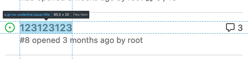
Improve commit record's ui in comment list ( #26619 )
...
Before:


After:


---------
Co-authored-by: silverwind <me@silverwind.io>
2024-03-14 19:01:16 +00:00
6543
36de5b299b
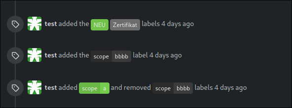
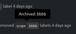
Highlight archived labels ( #29680 )
...
the issue is, that you can not distinguish between normal and archived
labels.
So this will make archived labels 80% **grayscale**. And prepend
"Archived: " to the tooltip info


---
*Sponsored by Kithara Software GmbH*
---------
Co-authored-by: delvh <dev.lh@web.de>
2024-03-12 17:32:05 +00:00
silverwind
851bd18234
Improve CSV rendering ( #29638 )
...
Before:
<img width="1332" alt="Screenshot 2024-03-06 at 21 42 17"
src="https://github.com/go-gitea/gitea/assets/115237/0ea07eee-31f8-4783-bd56-37bd8396f00d ">
After:
<img width="1336" alt="Screenshot 2024-03-06 at 21 41 58"
src="https://github.com/go-gitea/gitea/assets/115237/eb7f9cc9-587f-4e3b-92bd-cc67ca639963 ">
2024-03-10 20:28:59 +01:00
silverwind
9b69f76e5a
Completely style the webkit autofill ( #29683 )
...
Previously it was only partially styled, e.g. there was black text on
white background even in dark theme caused by fomantic styles.
<img width="195" alt="image"
src="https://github.com/go-gitea/gitea/assets/115237/bc5cf516-2aef-45c3-854a-c9f5497aacca ">
<img width="195" alt="Screenshot 2024-03-09 at 02 09 29"
src="https://github.com/go-gitea/gitea/assets/115237/ef0af17d-6e0b-402e-b24d-bfa34dc2f4e0 ">
Co-authored-by: Giteabot <teabot@gitea.io>
2024-03-09 12:14:42 +00:00
silverwind
82e102f8b0
Replace more gt- with tw- ( #29678 )
...
This will conclude the trivial class replacements.
2024-03-08 22:02:05 +01:00
silverwind
114bb505a3
Style fomantic grey labels ( #29458 )
...
Fomantic grey labels in the dashboard repo lists were showing original
fomantic colors, fixed that. Also slightly tweaked the light theme
colors so it uses same opacity values as dark theme.
<img width="165" alt="Screenshot 2024-03-07 at 21 06 23"
src="https://github.com/go-gitea/gitea/assets/115237/72744d6f-2ee1-4e5d-8ba0-b482a446f535 ">
<img width="167" alt="Screenshot 2024-03-07 at 21 06 00"
src="https://github.com/go-gitea/gitea/assets/115237/1ba93775-e5a9-4b28-b90f-59c1e9199687 ">
2024-03-08 09:42:12 +00:00
silverwind
16f1326514
Tweak actions color and borders ( #29640 )
...
- Increase contrast overall
- Unalias the ansi color in dark theme and copy them to light
- Add outer border
- Add border radius
<img width="1337" alt="Screenshot 2024-03-06 at 22 30 03"
src="https://github.com/go-gitea/gitea/assets/115237/11407c0f-0bb2-435e-a034-22b1f106d9b0 ">
<img width="1335" alt="Screenshot 2024-03-06 at 22 36 59"
src="https://github.com/go-gitea/gitea/assets/115237/267db442-0979-4acc-a79e-8579b4cb0262 ">
2024-03-06 22:44:24 +01:00
Rafael Heard
c996e35958
Move all login and account creation page labels to be above inputs ( #29432 )
...
There are a few inconsistencies within Gitea and this PR addresses one
of them. This PR updates the sign-in page layout, including the register
and openID tabs, to match the layout of the settings pages
(/user/settings) for more consistency.
This PR updates the following routes:
`/user/login`
`/user/sign_up`
`/user/login/openid`
`/user/forgot_password`
`/user/link_account`
`/user/recover_account`
**Before**
<img width="968" alt="Screenshot 2024-02-05 at 8 27 24 AM"
src="https://github.com/go-gitea/gitea/assets/6152817/fb0cb517-57c0-4eed-be1d-56f36bd1960d ">
**After**
<img width="968" alt="Screenshot 2024-02-05 at 8 26 39 AM"
src="https://github.com/go-gitea/gitea/assets/6152817/428d691d-0a42-4a67-a646-05527f2a7b41 ">
This PR addresses a revert of the original PR due to this
[comment](https://github.com/go-gitea/gitea/pull/28753#issuecomment-1956596817 ).
---------
Co-authored-by: rafh <rafaelheard@gmail.com>
2024-03-06 14:20:26 +00:00
silverwind
7e8c1c5ba1
Replace more gt- with tw-, update frontend docs ( #29595 )
...
Tested a few things, all working fine. Not sure if the chinese machine
translation is good.

---------

Co-authored-by: wxiaoguang <wxiaoguang@gmail.com>
2024-03-05 05:29:32 +00:00
wxiaoguang
ade6241691
Use flex wrap to layout the PR update button ( #29590 )
...
Follow #29418

I think using "flex-wrap: wrap" here is better than hard-coding the screen width.

By using "flex-wrap: wrap", the UI layouts automatically for various
widths (even if in some languages, the sentence might be pretty long)
2024-03-05 03:03:14 +00:00
charles
c660149a70
Do not exceed display for the PR page buttons on smaller screens ( #29418 )
...
Fixes #29189 .
This is the result after the fix at a width of 768 pixels.

2024-03-04 14:41:53 +00:00
wxiaoguang
62aa5e2cbd
Refactor star/watch button ( #29576 )
...
1. Use "star/unstart", but not `{{if}}un{{}}star{{}}` (the same to "watch/unwatch")
2. Use "not-mobile" for hiding the elements on mobile
2024-03-04 12:56:34 +00:00
silverwind
a2e90014ec
Replace some gt- classes with tw- ( #29570 )
...
Replace 18 `gt-` prefixes with `tw-` with perl replacement. I manually
checked them all with `rg` afterwards.
2024-03-04 03:33:20 +00:00
silverwind
e94e2fb6c5
Lighten text colors on dark theme for increased contrast ( #29481 )
...
Improve contrast by lightening the text colors in dark theme by around
35%. Additionally, share some variables that had the same or similar
color, which will ease future theme creation.
2024-02-29 05:11:11 +00:00
silverwind
6e1873288f
Improve contrast on blame timestamp, fix double border ( #29482 )
...
Before, double border on top, bad contrast on dark:
<img width="155" alt="Screenshot 2024-02-29 at 02 06 17"
src="https://github.com/go-gitea/gitea/assets/115237/fc0f1e08-a5ce-47ed-9eb6-135eed5a1abb ">
<img width="126" alt="Screenshot 2024-02-29 at 02 07 28"
src="https://github.com/go-gitea/gitea/assets/115237/38ae8483-8d9b-484c-8909-d4466131ea16 ">
After, no double border on top, good contrast:
<img width="154" alt="Screenshot 2024-02-29 at 02 20 20"
src="https://github.com/go-gitea/gitea/assets/115237/ad91282b-e9f5-4f41-8f5e-6ba28db3beac ">
<img width="147" alt="Screenshot 2024-02-29 at 02 20 38"
src="https://github.com/go-gitea/gitea/assets/115237/7ee2ec92-e72a-4981-aec3-98fc8e579bae ">
2024-02-29 10:00:33 +08:00
silverwind
850fc2516e
Apply compact padding to small buttons with svg icons ( #29471 )
...
The buttons on the repo release tab were larger in height than on other
tabs because one of them contained the RSS icon which stretched the
button height by 3px. Workaround this problem by applying the "compact"
padding to any such button. They are within 0.4px in height now to
non-icon buttons.
Before:
<img width="406" alt="Screenshot 2024-02-28 at 15 30 23"
src="https://github.com/go-gitea/gitea/assets/115237/805bb93a-6fe4-40a0-82d1-03001bee8ecf ">
After:
<img width="407" alt="Screenshot 2024-02-28 at 15 38 43"
src="https://github.com/go-gitea/gitea/assets/115237/27707588-890f-4852-ab08-105a57eda880 ">
For comparison, button on issue tab:
<img width="452" alt="Screenshot 2024-02-28 at 15 31 46"
src="https://github.com/go-gitea/gitea/assets/115237/74ac13d5-d016-49ba-9dd9-40ed32a748e9 ">
2024-02-28 21:26:12 +01:00
silverwind
d557fbc5a7
Recolor dark theme to blue shade ( #29283 )
...
Now uses the same primary color as light theme. The secondary colors are
shifted towards a slightly blue shade. Could maybe desaturate a bit
more, but overall I think I'm happy with it.
Fixes: https://github.com/go-gitea/gitea/issues/27097
<img width="1343" alt="Screenshot 2024-02-27 at 22 21 46"
src="https://github.com/go-gitea/gitea/assets/115237/4163c393-b469-4a53-8f4b-1c33aa04f3ac ">
<img width="581" alt="image"
src="https://github.com/go-gitea/gitea/assets/115237/e621f7f8-5679-4605-bf42-3d5ff1071e1e ">
<img width="581" alt="image"
src="https://github.com/go-gitea/gitea/assets/115237/20e66493-2457-482b-b8f1-e5710934e189 ">
---------
Co-authored-by: Giteabot <teabot@gitea.io>
2024-02-28 11:16:15 +01:00
Lunny Xiao
9a8c90ee18
Use tailwind instead of gt-[wh]- helper classes ( #29423 )
...
Follow #29357
- Replace `gt-w-*` -> `tw-w-*` and remove `gt-w-*`
- Replace `gt-h-*` -> `tw-h-*` and remove `gt-h-*`
2024-02-27 14:31:41 +00:00
silverwind
f4b92578b4
Add tailwindcss ( #29357 )
...
This will get tailwindcss working on a basic level. It provides only the
utility classes, e.g. no tailwind base which we don't need because we
have our own CSS reset. Without the base, we also do not have their CSS
variables so a small amount of features do not work and I removed the
generated classes for them.

***Note for future developers: This currently uses a `tw-` prefix, so we
use it like `tw-p-3`.***

<details>
<summary>Currently added CSS, all false-positives</summary>

```
.\!visible{

    visibility: visible !important
}

.visible{

    visibility: visible
}

.invisible{

    visibility: hidden
}

.collapse{

    visibility: collapse
}

.static{

    position: static
}

.\!fixed{

    position: fixed !important
}

.absolute{

    position: absolute
}

.relative{

    position: relative
}

.sticky{

    position: sticky
}

.left-10{

    left: 2.5rem
}

.isolate{

    isolation: isolate
}

.float-right{

    float: right
}

.float-left{

    float: left
}

.mr-2{

    margin-right: 0.5rem
}

.mr-3{

    margin-right: 0.75rem
}

.\!block{

    display: block !important
}

.block{

    display: block
}

.inline-block{

    display: inline-block
}

.inline{

    display: inline
}

.flex{

    display: flex
}

.inline-flex{

    display: inline-flex
}

.\!table{

    display: table !important
}

.inline-table{

    display: inline-table
}

.table-caption{

    display: table-caption
}

.table-cell{

    display: table-cell
}

.table-column{

    display: table-column
}

.table-column-group{

    display: table-column-group
}

.table-footer-group{

    display: table-footer-group
}

.table-header-group{

    display: table-header-group
}

.table-row-group{

    display: table-row-group
}

.table-row{

    display: table-row
}

.flow-root{

    display: flow-root
}

.inline-grid{

    display: inline-grid
}

.contents{

    display: contents
}

.list-item{

    display: list-item
}

.\!hidden{

    display: none !important
}

.hidden{

    display: none
}

.flex-shrink{

    flex-shrink: 1
}

.shrink{

    flex-shrink: 1
}

.flex-grow{

    flex-grow: 1
}

.grow{

    flex-grow: 1
}

.border-collapse{

    border-collapse: collapse
}

.select-all{

    user-select: all
}

.resize{

    resize: both
}

.flex-wrap{

    flex-wrap: wrap
}

.overflow-visible{

    overflow: visible
}

.rounded{

    border-radius: 0.25rem
}

.border{

    border-width: 1px
}

.text-justify{

    text-align: justify
}

.uppercase{

    text-transform: uppercase
}

.lowercase{

    text-transform: lowercase
}

.capitalize{

    text-transform: capitalize
}

.italic{

    font-style: italic
}

.text-red{

    color: var(--color-red)
}

.text-shadow{

    color: var(--color-shadow)
}

.underline{

    text-decoration-line: underline
}

.overline{

    text-decoration-line: overline
}

.line-through{

    text-decoration-line: line-through
}

.outline{

    outline-style: solid
}

.ease-in{

    transition-timing-function: cubic-bezier(0.4, 0, 1, 1)
}

.ease-in-out{

    transition-timing-function: cubic-bezier(0.4, 0, 0.2, 1)
}

.ease-out{

    transition-timing-function: cubic-bezier(0, 0, 0.2, 1)
}
```

</details>

---------

Co-authored-by: Giteabot <teabot@gitea.io>
2024-02-25 17:46:46 +01:00
Tim-Nicas Oelschläger
532e422027
Unify organizations header ( #29248 )
...
Unify organizations header
before:
after:

---------
Co-authored-by: silverwind <me@silverwind.io>
2024-02-23 01:24:57 +01:00
Lunny Xiao
e6e50696b8
Revert #28753 because UI broken. ( #29293 )
...
Revert #29255
Revert #28753
2024-02-21 22:14:37 +08:00
Rafael Heard
e4e5d76932
Left align the input labels for the link account page ( #29255 )
...
In a previous [PR](https://github.com/go-gitea/gitea/pull/28753 ) we
moved the labels to be above the inputs. The PR ensures that the
alignment is also on both tabs of the link account page
(`/user/link_account`).
Before
<img width="1094" alt="before"
src="https://github.com/go-gitea/gitea/assets/6152817/ac1e86bd-c4d6-4e45-87d1-87bb8a736149 ">
After
<img width="1094" alt="after"
src="https://github.com/go-gitea/gitea/assets/6152817/1b5fc109-f4d2-43ee-b924-0a9e53a0e391 ">
---------
Co-authored-by: rafh <rafaelheard@gmail.com>
2024-02-19 20:01:48 -05:00
silverwind
39f8ab591c
Clean up diff header css and reduce global textarea min-height ( #29232 )
...
1. Tweak diff header and remove a numbe of unneeded CSS for it:
Before:
<img width="433" alt="Screenshot 2024-02-18 at 01 08 09"
src="https://github.com/go-gitea/gitea/assets/115237/d8b377c0-57bc-44d5-bb57-a582c7d4b3b4 ">
After:
<img width="463" alt="Screenshot 2024-02-18 at 01 07 56"
src="https://github.com/go-gitea/gitea/assets/115237/d08c17e7-5b86-4d07-81da-6371f4754325 ">
3. Reduce height of review textarea and also reduce fomantic's CSS from
12em to 8em. Now fits better on my screen:
<img width="1352" alt="image"
src="https://github.com/go-gitea/gitea/assets/115237/5c658d13-295e-4929-94da-13ade888020d ">
---------
Co-authored-by: delvh <dev.lh@web.de>
2024-02-18 14:51:21 +00:00
Tim-Nicas Oelschläger
374e886f51
Change webhook-type in create-view ( #29114 )
...
It's now possible to change webhook-type in create-view.
before:
after:

---------
Co-authored-by: silverwind <me@silverwind.io>
Co-authored-by: Giteabot <teabot@gitea.io>
2024-02-15 14:59:48 +01:00
Rafael Heard
1c14cd0c43
move sign in labels to be above inputs ( #28753 )
...
There are a few inconsistencies within Gitea and this PR addresses one of them.
This PR updates the sign-in page layout, including the register and openID tabs,
to match the layout of the settings pages (`/user/settings`) for more consistency.
**Before**
<img width="968" alt="Screenshot 2024-02-05 at 8 27 24 AM"
src="https://github.com/go-gitea/gitea/assets/6152817/fb0cb517-57c0-4eed-be1d-56f36bd1960d ">
**After**
<img width="968" alt="Screenshot 2024-02-05 at 8 26 39 AM"
src="https://github.com/go-gitea/gitea/assets/6152817/428d691d-0a42-4a67-a646-05527f2a7b41 ">
---------
Co-authored-by: rafh <rafaelheard@gmail.com>
2024-02-15 09:47:49 +01:00
Yarden Shoham
12865ae9c6
Add alert blocks in markdown ( #29121 )
...
- Follows https://github.com/go-gitea/gitea/pull/21711
- Closes https://github.com/go-gitea/gitea/issues/28316
Implement GitHub's alert blocks markdown feature
Docs:
-
https://docs.github.com/en/get-started/writing-on-github/getting-started-with-writing-and-formatting-on-github/basic-writing-and-formatting-syntax#alerts
- https://github.com/orgs/community/discussions/16925
### Before
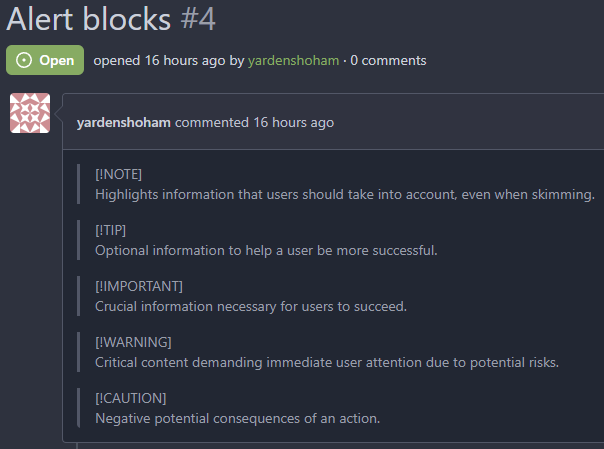
### After

## ⚠️ BREAKING ⚠️
The old syntax no longer works
How to migrate:
If you used
```md
> **Note** My note
```
Switch to
```md
> [!NOTE]
> My note
```
---------
Signed-off-by: Yarden Shoham <git@yardenshoham.com>
Co-authored-by: silverwind <me@silverwind.io>
Co-authored-by: Giteabot <teabot@gitea.io>
2024-02-10 18:43:09 +00:00
silverwind
9063fa0963
Remove obsolete border-radius on comment content ( #29128 )
...
This border-radius is obsolete since we changed the comment rendering a
few months ago and it caused incorrect display on blockquotes.
Before:
<img width="160" alt="Screenshot 2024-02-10 at 18 42 48"
src="https://github.com/go-gitea/gitea/assets/115237/ccbf4660-acf9-4268-aad9-1ad49d317a67 ">
After:
<img width="135" alt="Screenshot 2024-02-10 at 18 42 40"
src="https://github.com/go-gitea/gitea/assets/115237/6f588e02-3b2a-49ee-b459-81d8068b2f4e ">
2024-02-10 20:18:46 +02:00
Yarden Shoham
5f5b5ba6e3
Make blockquote border size less aggressive ( #29124 )
...
It's too thick
I made it match GitHub's size
# Before
# After
Signed-off-by: Yarden Shoham <git@yardenshoham.com>
2024-02-10 14:55:46 +02:00
KN4CK3R
c3e462921e
Improve user search display name ( #29002 )
...
I tripped over this strange method and I don't think we need that
workaround to fix the value.
old:
new:
---------
Co-authored-by: silverwind <me@silverwind.io>
Co-authored-by: wxiaoguang <wxiaoguang@gmail.com>
2024-02-01 17:10:16 +00:00
Yarden Shoham
0e650dca30
Make loading animation less aggressive ( #28955 )
...
The current animation loops in a very fast manner, causing a slight
feeling of uncomfortableness. This change slows it a bit for a smoother
experience.
# Before
# After

Signed-off-by: Yarden Shoham <git@yardenshoham.com>
2024-01-27 20:27:37 +08:00
Jimmy Praet
ee3e83eec1
Don't reload timeline page when (un)resolving or replying conversation ( #28654 )
...
Fixes #15981
2024-01-24 03:26:28 +00:00
JakobDev
885cc32b14
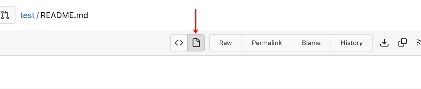
Show latest commit for file ( #28067 )
...
If you view a file, you can now see the latest commit that changed that file.

---------
Co-authored-by: Denys Konovalov <kontakt@denyskon.de>
2024-01-15 17:42:15 +01:00
wxiaoguang
ad0b637d46
Fix button size in "attached header right" ( #28770 )
...
Before:
<details>

</details>
After:


2024-01-12 14:43:40 +00:00
wxiaoguang
34a0684397
Improve CSS helper naming ( #28769 )
...
* `gt-w-100` => `gt-w-full` to match tailwind
* clarify `gt-hidden` priority
2024-01-12 20:28:01 +08:00
Denys Konovalov
7d62615513
Revamp repo header ( #27760 )
...
Redesign repo header with following new aspects:
- responsive & better-looking repo title
- hide repo button text instead of icons in mobile view
- use same tab style as on explore and org page
<details>
<summary>Before:</summary>


</details>
<details>
<summary>After:</summary>


2024-01-12 03:44:06 +00:00
Kyle D
e522e774ca
Add merge arrow direction and update styling ( #28523 )
...
Close https://github.com/go-gitea/gitea/issues/28522
~Adds some [negative
margin](https://tailwindcss.com/docs/margin#using-negative-values )
helper css classes using tailwind's [prefix
syntax](https://tailwindcss.com/docs/configuration#prefix )~
### Before
### After
2024-01-05 17:38:56 +00:00
Earl Warren
92711b001e
Apply min-height in wiki only on preview pane ( #28687 )
...
In the commit 5a56f9699chttps://codeberg.org/forgejo/forgejo/pulls/2080
(cherry picked from commit 8f0baefe5dadc929fe7456c36c8b205e96f228f0)
Co-authored-by: Fl1tzi <git@fl1tzi.com>
2024-01-04 02:48:55 +00:00
Denys Konovalov
657b23d635
Fix wrapping of label list ( #28684 )
...
The label list needs to wrap the items to avoid unnecessary overflow / incorrect text wrapping.
2024-01-03 20:33:55 +08:00
wxiaoguang
8989d466ed
Fix flex container width ( #28603 )
...
Fix #28489
2023-12-24 22:39:02 +08:00
KazzmanK
2de05f9432
Decrease issue font size in project template ( #28054 )
...
I propose to decrease font size. 18 is too big and looks ugly, on
windows. 14 is on par with other elements and save a bit of space.


Co-authored-by: Nikolay Kobzarev <n.kobzarev@aeronavigator.ru>
2023-11-19 02:02:26 +00:00
sebastian-sauer
e31c6cfe6e
Fix Show/hide filetree button on small displays ( #27881 )
...
the gt-df's display:flex !important did override the display:none on small displays

---------

Co-authored-by: wxiaoguang <wxiaoguang@gmail.com>
2023-11-17 18:35:51 +00:00
sebastian-sauer
49dddd87b1
Improve PR diff view on mobile ( #27883 )
...
1. Show diff stats only on large screens
these are already shown in tabs, so no need for this duplicate
information on small screens
2. Hide viewed files information on small screens
Github does the same and this gives us more free space on small screens

3. Review bar now doesn't wrap so we don't need the 77px even on very
small screens
(the sticky headers are still working)

2023-11-16 11:58:53 +08:00
yp05327
4a0103fa29
Add word-break to repo description in home page ( #27924 )
...
In #25315 , @denyskon fixed UI on mobile view.
But for the repo description, on desktop view there's no word-break.
So maybe we can just add `gt-word-break` to fix it on both mobile view
and desktop view.
Before:
desktop view:

mobile view:

After:
desktop view:

mobile view(almost same?)

---------
Co-authored-by: silverwind <me@silverwind.io>
2023-11-07 23:52:08 +00:00
wxiaoguang
10a6ebb3fd
Fix the overflow style for "Hide all checks" ( #27932 )
...
Fix #27928

---------

Co-authored-by: silverwind <me@silverwind.io>
2023-11-07 18:53:35 +00:00
yp05327
dcb648ee71
Add Hide/Show all checks button to commit status check ( #26284 )
...
Step one for a GitHub like commit status check ui:
Step two:


The design now will list all commit status checks which takes too much
space.
This is a pre-improve for #26247
---------
Co-authored-by: delvh <dev.lh@web.de>
Co-authored-by: silverwind <me@silverwind.io>
Co-authored-by: wxiaoguang <wxiaoguang@gmail.com>
2023-11-02 14:49:02 +00:00
silverwind
dc52f26d46
Reduce margin/padding on flex-list items and divider ( #27872 )
...
Small CSS tweak, reduces margin/padding from 14px to 10px, which I think
looks better
2023-11-02 12:30:38 +08:00
silverwind
05aa91e6da
Add dedicated class for empty placeholders ( #27788 )
...
Fixes: https://github.com/go-gitea/gitea/issues/27784
<img width="1033" alt="Screenshot 2023-10-25 at 19 07 15"
src="https://github.com/go-gitea/gitea/assets/115237/1a363851-1a86-48cb-99ec-0a573371bb6e ">
<img width="1051" alt="Screenshot 2023-10-25 at 19 07 41"
src="https://github.com/go-gitea/gitea/assets/115237/add4b606-2264-430a-af35-249ef005817f ">
Co-authored-by: KN4CK3R <admin@oldschoolhack.me>
2023-10-25 23:42:14 +02:00
yp05327
f39256f035
Add word-break to organization name and description ( #26624 )
...
Fix #24318
Before:


After:


2023-10-25 10:40:39 +00:00
silverwind
fba4ee7efc
Add gap between diff boxes ( #27776 )
...
Before (almost no gap between files):
<img width="1240" alt="Screenshot 2023-10-24 at 19 43 32"
src="https://github.com/go-gitea/gitea/assets/115237/30cdbdbc-d102-479c-89ce-3f68837ae0cd ">
After (with 8px gap):
<img width="1241" alt="Screenshot 2023-10-24 at 19 43 22"
src="https://github.com/go-gitea/gitea/assets/115237/72b26a30-8730-4a36-8de9-be143b684b98 ">
2023-10-25 00:47:17 +02:00
MrDevil
510d07506e
[FIX] resolve confusing colors in languages stats by insert a gap ( #27704 )
...
The current language stats are too obsessed with color matching. Similar
colors are always next to each other. It is a bit troublesome to find
the place where the color matching is generated, so just follow the
example of github and add a gap.
## before
<img width="883" alt="image"
src="https://github.com/go-gitea/gitea/assets/12915306/cf54430c-616c-4b37-b561-5a37c20b2d94 ">
## after
<img width="877" alt="image"
src="https://github.com/go-gitea/gitea/assets/12915306/e518ea36-2b8f-4f11-a867-a58dc393db85 ">
2023-10-20 17:33:05 +00:00
silverwind
4539a7b0b4
Fix sticky diff header background ( #27697 )
...
Fixes: https://github.com/go-gitea/gitea/issues/27604
Add negative margins so the header covers any shadow of active elements.
No rendering change of the content of the header because the padding
counteracts the effect.
<img width="128" alt="image"
src="https://github.com/go-gitea/gitea/assets/115237/3d0f55b6-9351-4985-a290-da9a92d15b4e ">
2023-10-20 14:56:19 +00:00
puni9869
4adc2a828d
Hide archived labels by default from the suggestions when assigning labels for an issue ( #27451 )
...
Followup of #27115
Finally closes #25237
## Screenshots
### Issue Sidebar
<img width="513" alt="image"
src="https://github.com/go-gitea/gitea/assets/80308335/9f7fda2f-5a03-4684-8619-fd3498a95b41 ">
### PR sidebar
<img width="367" alt="image"
src="https://github.com/go-gitea/gitea/assets/80308335/53db9b64-faec-4a67-91d6-76945596a469 ">
### PR sidebar with archived labels shown
<img width="352" alt="image"
src="https://github.com/go-gitea/gitea/assets/80308335/9dc5050f-4e69-4f76-bb83-582480a2281e ">
---------
Signed-off-by: puni9869 <punitinani1@hotmail.com>
Co-authored-by: silverwind <me@silverwind.io>
2023-10-17 16:10:45 +02:00
wxiaoguang
6c501b1498
Improve dropdown button alignment and fix hover bug ( #27632 )
...
1. fix #27631 , and add samples to devtest page
2. fix incorrect color for "ui dropdown button" when hover
2023-10-16 07:26:08 +00:00
silverwind
532f166c4d
Enable shorthands in declaration-strict-value linter ( #27597 )
...
Enable [shorthand
matching](https://github.com/AndyOGo/stylelint-declaration-strict-value#expandshorthand )
in this lint rule and match color properties by regex. Patterns like
this will now fail lint:
```css
background: #123456 ;
border: 1px sold rgba(0,0,0,0);
```
2023-10-13 08:19:21 +00:00
Kyle D
ac4ae35542
Remove max-width and add hide text overflow ( #27359 )
...
Closes https://github.com/go-gitea/gitea/issues/27358
2023-10-09 19:04:31 -04:00
Gary Wang
abe8fe3527
Add hover background to wiki list page ( #27507 )
...
This patch adds a hover background for the wiki row in wiki list page,
which make its behavior more close to repo's file list page.
This patch also make the wiki-git-entry visible on the row is hovered
instead of the cel, so users won't be confused since the 'grid' is not
visible from the web page.
After the patch: (when the wiki named 'Home' is hovered)

2023-10-08 10:07:55 +00:00
silverwind
023e937141
Rename the default themes to gitea-light, gitea-dark, gitea-auto ( #27419 )
...
Part of https://github.com/go-gitea/gitea/issues/27097 :
- `gitea` theme is renamed to `gitea-light`
- `arc-green` theme is renamed to `gitea-dark`
- `auto` theme is renamed to `gitea-auto`
I put both themes in separate CSS files, removing all colors from the
base CSS. Existing users will be migrated to the new theme names. The
dark theme recolor will follow in a separate PR.
## ⚠️ BREAKING ⚠️
1. If there are existing custom themes with the names `gitea-light` or
`gitea-dark`, rename them before this upgrade and update the `theme`
column in the `user` table for each affected user.
2. The theme in `<html>` has moved from `class="theme-name"` to
`data-theme="name"`, existing customizations that depend on should be
updated.
---------
Co-authored-by: Lunny Xiao <xiaolunwen@gmail.com>
Co-authored-by: Giteabot <teabot@gitea.io>
2023-10-06 09:46:36 +02:00
Denys Konovalov
33de64cb21
link to file from its history ( #27354 )
...
Fixes #3852
Fixes https://github.com/go-gitea/gitea/issues/26707

Add a button on file history which directs you to the file at the
selected commit.

Co-authored-by: silverwind <me@silverwind.io>
2023-10-02 04:04:32 +00:00
puni9869
50070550a8
Hide archived labels when filtering by labels on the issue list ( #27115 )
...
Followup https://github.com/go-gitea/gitea/pull/26820
## Archived labels UI for issue filter and issue filter actions for
issues/pull request pages.
Changed:
* Enhanced the Issue filter and Issue filter actions UI page to
seamlessly incorporate a list of archived labels.
* Pagination functionality is same as before. If archived label checkbox
is checked then we are adding a query string`archived=true` in the url
to save the state of page.
* Issue filter actions menu is separated into different template.
* Adding the archived flag in issue url labels.
* Pull Request page is also work the same.
Outsourced:
* Defer the implementation of specialized handling for archived labels
to upcoming pull requests. This step will be undertaken subsequent to
the successful merge of this pull request.
Screenshots
### Issue page
<img width="1360" alt="image"
src="https://github.com/go-gitea/gitea/assets/80308335/d7efb2ef-5b2b-449d-83f0-d430a32ec432 ">
### Issue page with label filter on archived label checkbox when not
checked --> No archived label is there in list
<img width="1249" alt="image"
src="https://github.com/go-gitea/gitea/assets/80308335/ceea68ef-91f2-4693-910f-2e25e236bfc9 ">
### Issue page with label filter on archived label checkbox when checked
--> Show archived label in the list.
<img width="710" alt="image"
src="https://github.com/go-gitea/gitea/assets/80308335/2414d26b-2079-4c3c-bd9e-f2f5411bcabf ">
### Issue page with label filter on issue action menu on archived label
checkbox when checked --> Show archived label in the list.
<img width="409" alt="image"
src="https://github.com/go-gitea/gitea/assets/80308335/259cac87-3e21-4778-99a2-a6a0b8c81178 ">
### Applied the archived=true in Issue labels when archived checkbox is
checked.
<img width="984" alt="image"
src="https://github.com/go-gitea/gitea/assets/80308335/657ce3db-c0ae-402e-b12d-3b580d3c2ed0 ">
---
Part of https://github.com/go-gitea/gitea/issues/25237
---------
Signed-off-by: puni9869 <punitinani1@hotmail.com>
Co-authored-by: delvh <dev.lh@web.de>
Co-authored-by: Giteabot <teabot@gitea.io>
2023-10-01 09:04:39 -04:00
silverwind
83f571628d
Feed UI Improvements ( #27356 )
...
Various improvements related to feeds:
- Fix markdown rendering
- Increase font size from 13px to default 14px via `flex-item`
- Add style to hashes
- Move the timestamp to title line. I realize it's not optimal for
translation, we may need to change all these translations
Before:
<img width="768" alt="Screenshot 2023-09-29 at 22 52 58"
src="https://github.com/go-gitea/gitea/assets/115237/edda8b84-23cf-4a43-90ad-a892798f4e6c ">
After:
<img width="781" alt="Screenshot 2023-09-29 at 22 58 09"
src="https://github.com/go-gitea/gitea/assets/115237/7097474d-efcf-4f22-a2ab-834a4e25c4e8 ">
2023-09-30 15:48:34 +00:00
Rafael Heard
4cb51cb985
Absolute positioned checkboxes overlay floated elements ( #26870 )
...
Currently, checkboxes are positioned as absolute. This positioning
causes the input to overlay an element that has been floated within the
editor. Floated elements are useful if you want your text to wrap around
this element. This PR fixes the overlaying of checkboxes by removing the
absolute positioning, updating the `ul` padding, and
displaying`.task-list-item` `flex` to ensure inputs and the associated
label are on the same line.
Screenshots:
Before:
<img width="762" alt="Screenshot 2023-09-01 at 3 40 59 PM"
src="https://github.com/go-gitea/gitea/assets/6152817/570247c7-7f5c-4697-bfc9-ad4655e37991 ">
After:
<img width="762" alt="Screenshot 2023-09-01 at 3 42 20 PM"
src="https://github.com/go-gitea/gitea/assets/6152817/db53df45-1294-4eee-84c0-b21ac4fdf805 ">
---------
Co-authored-by: rafh <rafaelheard@gmail.com>
2023-09-30 09:30:44 +00:00
wxiaoguang
1f00bc44b2
Fix review UI ( #27322 )
...
Close #26730
1. The `diff-detail-box` was abused, it shouldn't be used for
"DiffFileList/DiffFileTree".
2. Fix the sticky position for various screens.


2023-09-28 10:00:26 +00:00
wxiaoguang
72c68177ab
Improve issue history dialog and make poster can delete their own history ( #27323 )
...
Fix #27313 (see the comment)
And some UI improvements:
### Before

### After


2023-09-28 08:43:20 +00:00
wxiaoguang
7ea2a910ce
Improve branch list UI ( #27319 )
...
1. Put the `"octicon-shield-lock"` into the flex container, then it
doesn't need a separate flex box
2. Remove some unnecessary `gt-df` helpers
3. Make `btn` button has the same flex behavior as `ui button`

2023-09-28 04:04:32 +00:00
silverwind
6af34c09a7
Use mask-based fade-out effect for .new-menu ( #27181 )
...
The `.new-menu` was using a pseudo-element based fade-out effect.
Replace this with a more modern mask-based effect which in this case
required a child element to avoid fading out the background as well, so
I applied it to child `new-menu-inner` which was present on all these
menus except explore where I added it.
There is no visual difference except that the items on the explore page
have no `gap` between them any longer, making it consistent with other
menus. Before and after:
<img width="221" alt="Screenshot 2023-09-21 at 21 13 19"
src="https://github.com/go-gitea/gitea/assets/115237/b4a38ce2-cee1-4c54-84a5-e1d0bfd79e29 ">
<img width="222" alt="Screenshot 2023-09-21 at 21 32 36"
src="https://github.com/go-gitea/gitea/assets/115237/bb6b1335-d935-4ad4-bb85-3b0fc3027c2b ">
Also, this cleans up the related CSS vars:
- `--color-header-wrapper-transparent` is removed, no longer needed
- `--color-header-wrapper` is defined in base theme as well, was
previously unset and therefor transparent.
[no whitespace
diff](https://github.com/go-gitea/gitea/pull/27181/files?diff=unified&w=1 )
[demo of mask fade](https://jsfiddle.net/silverwind/tsfadb3u/ )
2023-09-25 01:03:00 +00:00
silverwind
a50002c75c
Fix z-index on markdown completion ( #27237 )
...
Fixes: https://github.com/go-gitea/gitea/issues/27230
2023-09-25 01:29:36 +02:00
Denys Konovalov
63b25e816d
fix issues on action runners page ( #27226 )
...
- switch from some weird status badge to label
- translate untranslated `Reset registration token` string
- change documentation link from act_runner README to Gitea Docs site
- fix "No runners available" message width
- use `ctx.Locale.Tr` where possible

2023-09-24 14:12:21 -04:00
wxiaoguang
c2cabe7b28
Fix repo sub menu ( #27169 )
...
Fix #27166
2023-09-21 21:16:14 +08:00
silverwind
8099238618
Change green buttons to primary color ( #27099 )
...
I think it's better if the primary actions have primary color instead of
green which fits better into the overall single-color UI design. This PR
currently replaces every green button with primary:
<img width="141" alt="Screenshot 2023-09-16 at 14 07 59"
src="https://github.com/go-gitea/gitea/assets/115237/843c1e50-4fb2-4ec6-84ba-0efb9472dcbe ">
<img width="161" alt="Screenshot 2023-09-16 at 14 07 51"
src="https://github.com/go-gitea/gitea/assets/115237/9442195a-a3b2-4a42-b262-8377d6f5c0d1 ">
Modal actions now use uncolored/primary instead of previous green/red
colors. I also removed the box-shadow on all basic buttons:
<img width="259" alt="Screenshot 2023-09-16 at 14 16 39"
src="https://github.com/go-gitea/gitea/assets/115237/5beea529-127a-44b0-8d4c-afa7b034a490 ">
<img width="261" alt="Screenshot 2023-09-16 at 14 17 42"
src="https://github.com/go-gitea/gitea/assets/115237/4757f7b2-4d46-49bc-a797-38bb28437b88 ">
The change currently includes the "Merge PR" button, for which we might
want to make an exception to match the icon color there:
<img width="442" alt="Screenshot 2023-09-16 at 14 33 53"
src="https://github.com/go-gitea/gitea/assets/115237/993ac1a5-c94d-4895-b76c-0d872181a70b ">
2023-09-18 22:05:31 +00:00
puni9869
a50d9af876
Display archived labels specially when listing labels ( #26820 )
...
Follow up https://github.com/go-gitea/gitea/pull/26741

Changes:
Added archived label for org labels and added into issue filter list.


Part of https://github.com/go-gitea/gitea/issues/25237

---------

Signed-off-by: puni9869 <punitinani1@hotmail.com>
Co-authored-by: silverwind <me@silverwind.io>
2023-09-18 04:54:05 +00:00
wxiaoguang
e97baed800
Remove a gt-float-right and some unnecessary helpers ( #27110 )
...
Follow Remove polluted .ui.right #26825
Remove more `gt-float-right`, remove unnecessary helpers, remove
negative margin tricks.

2023-09-18 12:25:36 +08:00
puni9869
a1b2a11812
Ui correction in mobile view nav bar left aligned items. ( #27046 )
...
As title
From the long time I was looking for this UI, Now its the time to fix
it.
Before
<img width="252" alt="image"
src="https://github.com/go-gitea/gitea/assets/80308335/963f2cb4-5cfd-4a14-ab85-88e25c3daef5 ">
<img width="502" alt="image"
src="https://github.com/go-gitea/gitea/assets/80308335/58453ef1-2555-4568-95d0-5293055b33b8 ">
---------
Co-authored-by: wxiaoguang <wxiaoguang@gmail.com>
Co-authored-by: Giteabot <teabot@gitea.io>
2023-09-16 16:09:25 +02:00
Kerwin Bryant
a38eca3f52
Fix Fomantic's line-height causing vertical scrollbars to appear ( #26961 )
...
Before:

After:

---
1. **Remove the scroll bar exception that in the a tag**
2. **Reduce the actual width of the a tag to the actual width of the
content**
As shown in the screenshot, the red box area should not be clickable
2023-09-13 09:08:45 +00:00
puni9869
0989f437df
Dashboard context dropdown position fix on landing page in mobile view. ( #27047 )
...
as title.
Screensots
before

after

2023-09-13 15:15:36 +08:00
wxiaoguang
739e47cd80
Improve repo/user/org search ( #27030 )
...
* Fix a regression from #26809 (the `data-org` is missing)
* Remove unnecessary style
Screenshots:


2023-09-12 16:44:48 +00:00
wxiaoguang
1875362383
Fix "delete" modal dialog for issue/PR ( #27015 )
...
Close #27012
By the way, rename the single-word ID to a long ID.
2023-09-11 17:06:05 +00:00
wxiaoguang
dd6e8ab57b
Improve "language stats" UI ( #26968 )
...
Before:
* The layout is quite complex
* The UI flickers when switch the stats (https://try.gitea.io/ )
After:
* Simplify the code
* The UI doesn't flicker
2023-09-10 18:27:23 +08:00
wxiaoguang
58abd4f06c
Improve issue list layout ( #26983 )
...
Align everything with a new layout.

* Use "baseline" for some special elements, the "flex-item-icon" is for
the issue list only at the moment and I think it should be general
enough now (but not using "flex-item-leading" anymore in this case).
* Make the labels stretch themselves.
2023-09-09 20:23:57 +08:00
silverwind
4693bdbda0
Chroma color tweaks ( #26978 )
2023-09-08 11:03:01 -05:00
wxiaoguang
ffa4949eaa
Improve flex list UI ( #26970 )
...
1. There is already `gt-ac`, so no need to introduce `flex-item-center`
2. The `flex-item-baseline` and `.flex-item-icon svg { margin-top: 1px
}` seem to be a tricky patch, they don't resolve the root problem, and
still cause misalignment in some cases.
* The root problem is: the "icon" needs to align with the sibling
"title"
* So, make the "icon" and the "title" both have the same height
3. `flex-text-inline` could only be used if the element is really
"inline", otherwise its `vertical-align` would make the box size change.
In most cases, `flex-text-block` is good enough.
---------
Co-authored-by: silverwind <me@silverwind.io>
Co-authored-by: Giteabot <teabot@gitea.io>
2023-09-08 13:57:18 +00:00
wxiaoguang
1221221595
Add "dir=auto" for input/textarea elements by default ( #26735 )
...
Co-authored-by: silverwind <me@silverwind.io>
Co-authored-by: Giteabot <teabot@gitea.io>
2023-09-07 08:00:20 +00:00
wxiaoguang
419003adb2
Improve SSH Key / GPG Key / Deploy Key UI ( #26949 )
...
1. In many cases, the `flex-list` has previous and next `gt-hidden`
siblings, so relax the CSS selector to remove all ".segument .flex-list"
paddings.
2. Make the "Add key" button can toggle
3. Move help message into the related segment(panel). Otherwise users
would misread the message, eg: the SSH help seemed for GPG because they
are so near
4. Move modal element into the segment element, otherwise it affects the
layout
2023-09-07 01:13:11 +00:00
wxiaoguang
2715ef6558
Fix scoped label layout ( #26932 )
...
Fix #26931
2023-09-06 12:22:38 +00:00
Kerwin Bryant
113eb5fc24
Fix UI anomalies ( #26929 )
2023-09-06 07:00:45 +00:00
wxiaoguang
682552378f
More fixes for the "commit-body" ( #26898 )
...
The changes for "commit-body" in #26877 are not ideal.

The reason is: the "commit-body" is usually a `<pre>`, it has default
margins. In most cases, we do not need that large margin. So, this PR
introduces a general but small margin for all "commit-body" elements.
Then these `gt-m-0` could be removed.

The `:not` selector is not needed, because the `.timeline-item` selector
is already clear enough.
2023-09-04 13:38:59 +00:00
wxiaoguang
51cfe0e7de
Remove CSS has selector and improve various styles ( #26891 )
...
Replace #26850
Major changes:
1. Remove all `has` selectors, it is still not supported by firefox.
Actually there could be some more general and clearer approaches
2. Remove `two-toggle-buttons`, the `.ui.buttons` just works well
3. Rewrite the `.ui.buttons` border styles, see the screenshots
4. Remove the "fine-tuning" paddings from the the flex children, they
could layout themselves well.


2023-09-04 18:22:46 +08:00
wxiaoguang
fba7150ca9
Refactor "shortsha" ( #26877 )
...
The old code used complex `if` blocks and strange HTML layouts.
<details>

</details>
This PR refactors the template code and remove legacy CSS styles. The UI
doesn't change much.

2023-09-03 02:58:52 +00:00
6543
79f7329971
Make it posible to customize nav text color via css var ( #26807 )
...
---
*Sponsored by Kithara Software GmbH*
2023-09-02 05:10:41 +02:00
wxiaoguang
fcb4941d47
Remove some unused CSS styles ( #26852 )
...
1. `icons`: globally searched, no use in templates.
2. toast's `display: inline-block;`: there is a `display: flex` below.
2023-09-01 08:59:38 +02:00
silverwind
9b76df53dc
Minor dashboard tweaks, fix flex-list margins ( #26829 )
...
Some small dashboard tweaks:
- Remove margin-bottom from divider so first item does not appear to
have un-equal margins
- Restore previous icon color
- Add slight margin-right to icon
Before:
<img width="783" alt="Screenshot 2023-08-31 at 00 10 28"
src="https://github.com/go-gitea/gitea/assets/115237/b75f70d7-8704-4afb-866d-fea0484c52d4 ">
After:
<img width="783" alt="Screenshot 2023-08-31 at 00 10 08"
src="https://github.com/go-gitea/gitea/assets/115237/50ed0c47-6f7c-449e-a054-13091369d43f ">
---------
Co-authored-by: wxiaoguang <wxiaoguang@gmail.com>
2023-08-31 21:28:45 +00:00
wxiaoguang
d5703d4a1b
Remove "TODO" tasks from CSS file ( #26835 )
...
1. Use `gt-invisible` instead of `invisible`.
2. Use `gt-word-break` instead of `dont-break-out` (there is a slight
different "hyphens", but I think it won't affect too much since it is
only used for the "full name").
3. Remove `.small.button:has(svg)` , now our buttons could layout SVG
correctly, and actually I didn't see this CSS class is used in code.
2023-08-31 10:49:53 +00:00
Denys Konovalov
5b5bb8d354
User details page ( #26713 )
...
This PR implements a proposal to clean up the admin users table by
moving some information out to a separate user details page (which also
displays some additional information).
Other changes:
- move edit user page from `/admin/users/{id}` to
`/admin/users/{id}/edit` -> `/admin/users/{id}` now shows the user
details page
- show if user is instance administrator as a label instead of a
separate column
- separate explore users template into a page- and a shared one, to make
it possible to use it on the user details page
- fix issue where there was no margin between alert message and
following content on admin pages
<details>
<summary>Screenshots</summary>


</details>
Partially resolves #25939
---------
Co-authored-by: Giteabot <teabot@gitea.io>
2023-08-31 11:21:18 +02:00
silverwind
3d109861dd
Render code blocks in repo description ( #26830 )
...
Backtick syntax now works in repo description too. Also, I replaced the
CSS for this was a new single class, making it more flexible and not
dependent on a parent. Also, very slightly reduced font size from 16.8px
to 16px.

---------

Co-authored-by: wxiaoguang <wxiaoguang@gmail.com>
2023-08-31 05:01:01 +00:00
wxiaoguang
19a1e1b20e
Remove polluted .ui.right ( #26825 )
...
Each change is tested manually line by line. There are too many changes
so I can't share dozens of screenshots.

In short:

1. `ui right` could be still used in `ui top attached header`, because
there is a special case.
2. A lot of `ui right` are just no-op, so they can be removed safely.
3. Some of the `ui right` should be replaced by `gt-float-right` (to
avoid breaking, leave them to the future).
4. A few of the `ui right` could be rewritten by flex.
2023-08-31 02:29:59 +00:00
wxiaoguang
1bb9b1c4d9
Remove polluted ".ui.left" style ( #26809 )
2023-08-30 21:46:24 +08:00
delvh
2590707122
Remove fomantic text module ( #26777 )
...
Corollary to #26775 :
All selectors I found that are actually used and not necessarily present
in the current code have been copied to `web_src/css/base.css`.
Everything else should be a clean removal.
2023-08-30 10:37:17 +00:00
wxiaoguang
1a9998ce91
Improve flex list item padding ( #26779 )
...
Replace #26761
It's better to keep children elements simple, and let parent containers
layout the necessary padding/margin.
The old `not(:last-child)` and `.flex-item + .flex-item` are not easy to
maintain (for example, what if the developer would like to use a "tiny
height" item?)
The old approach also makes some UI look strange because the first item
doesn't have proper padding-top.
In this PR, we just simply use `.flex-item { padding: ... }`:
* Developers could manually set the item height they want easily
* It's easier to make it work with various containers -- with padding
(`ui segment`) and without padding (`div`)
And added more samples/examples.

Co-authored-by: Giteabot <teabot@gitea.io>
2023-08-29 23:13:30 +00:00
wxiaoguang
96ba747ff2
Fix notification circle (border-radius) ( #26794 )
...
`border-radius` means `radius`, not `diameter`, so it should be `50%` and `boxHeight / 2`
2023-08-29 14:03:34 +00:00
wxiaoguang
0ab70d4f2f
Improve modal dialog UI ( #26764 )
...
1. Fine tune the CSS styles, and add more examples
2. Add necessary "dimmer" animation for modal dialogs, otherwise the UI
seems flicking (follow #26469 )
2023-08-28 23:49:21 +00:00