* "mail/issue/default.tmpl": the body is rendered by backend
`markdown.RenderString() HTML`, it has been already sanitized
* "repo/settings/webhook/base_list.tmpl": "Description" is prepared by
backend `ctx.Tr`, it doesn't need to be sanitized
Part of #23318
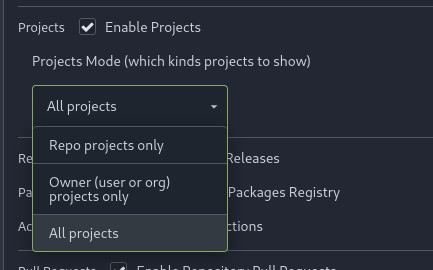
Add menu in repo settings to allow for repo admin to decide not just if
projects are enabled or disabled per repo, but also which kind of
projects (repo-level/owner-level) are enabled. If repo projects
disabled, don't show the projects tab.

---------
Co-authored-by: delvh <dev.lh@web.de>
Follow #29165

* some of them are incorrect, which would lead to double escaping (eg:
`(print (Escape $.RepoLink)`)
* other of them are not necessary, because `Tr` handles strings&HTML
automatically

Suggest to review by "unified view":
https://github.com/go-gitea/gitea/pull/29394/files?diff=unified&w=0
RenderEmojiPlain(emoji.ReplaceAliases) should be called explicitly for
some contents, but not for everything.

Actually in modern days, in most cases it doesn't need such
"ReplaceAliases". So only keep it for issue/PR titles.

If anyone really needs to do ReplaceAliases for some contents, I will
propose a following fix.
With this option, it is possible to require a linear commit history with
the following benefits over the next best option `Rebase+fast-forward`:
The original commits continue existing, with the original signatures
continuing to stay valid instead of being rewritten, there is no merge
commit, and reverting commits becomes easier.
Closes#24906
Fixes#27114.
* In Gitea 1.12 (#9532), a "dismiss stale approvals" branch protection
setting was introduced, for ignoring stale reviews when verifying the
approval count of a pull request.
* In Gitea 1.14 (#12674), the "dismiss review" feature was added.
* This caused confusion with users (#25858), as "dismiss" now means 2
different things.
* In Gitea 1.20 (#25882), the behavior of the "dismiss stale approvals"
branch protection was modified to actually dismiss the stale review.
For some users this new behavior of dismissing the stale reviews is not
desirable.
So this PR reintroduces the old behavior as a new "ignore stale
approvals" branch protection setting.
---------
Co-authored-by: delvh <dev.lh@web.de>
There is an accessibility issue in the interface when attempting to
delete a repository. When I click on "Delete repository," a dialog box
appears, requiring confirmation to proceed with the repository deletion.
However, when I press the "Repo name" label, the wrong input field gains
focus. The focused field is located behind the dialog and is intended
for renaming the repository.
This PR adds a new field `RemoteAddress` to both mirror types which
contains the sanitized remote address for easier (database) access to
that information. Will be used in the audit PR if merged.
1. There is already `gt-ac`, so no need to introduce `flex-item-center`
2. The `flex-item-baseline` and `.flex-item-icon svg { margin-top: 1px
}` seem to be a tricky patch, they don't resolve the root problem, and
still cause misalignment in some cases.
* The root problem is: the "icon" needs to align with the sibling
"title"
* So, make the "icon" and the "title" both have the same height
3. `flex-text-inline` could only be used if the element is really
"inline", otherwise its `vertical-align` would make the box size change.
In most cases, `flex-text-block` is good enough.

---------
Co-authored-by: silverwind <me@silverwind.io>
Co-authored-by: Giteabot <teabot@gitea.io>
1. In many cases, the `flex-list` has previous and next `gt-hidden`
siblings, so relax the CSS selector to remove all ".segument .flex-list"
paddings.
2. Make the "Add key" button can toggle
3. Move help message into the related segment(panel). Otherwise users
would misread the message, eg: the SSH help seemed for GPG because they
are so near
4. Move modal element into the segment element, otherwise it affects the
layout
I noticed that the code of several new webhook pages is highly
repetitive, so I pulled out the common parts to a new template, unified
reference, unified maintenance

---------

Co-authored-by: KN4CK3R <admin@oldschoolhack.me>
Each change is tested manually line by line. There are too many changes
so I can't share dozens of screenshots.

In short:

1. `ui right` could be still used in `ui top attached header`, because
there is a special case.
2. A lot of `ui right` are just no-op, so they can be removed safely.
3. Some of the `ui right` should be replaced by `gt-float-right` (to
avoid breaking, leave them to the future).
4. A few of the `ui right` could be rewritten by flex.
Fix#26731
Almost all "tabindex" in code are incorrect.
1. All "input/button" by default are focusable, so no need to use "tabindex=0"
2. All "div/span" by default are not focusable, so no need to use "tabindex=-1"
3. All "dropdown" are focusable by framework, so no need to use "tabindex"
4. Some tabindex values are incorrect (eg: `new_form.tmpl`), so remove them
Co-authored-by: Giteabot <teabot@gitea.io>
I kept sending pull requests that consisted of one-line changes. It's
time to
settle this once and for all. (Maybe.)

- Explain Gitea behavior and the consequences of each
  setting better, so that the user does not have to consult
  the docs.
- Do not use different spellings of identical terms
  interchangeably, e.g. `e-mail` and `email`.
- Use more conventional terms to describe the same things,
  e.g. `Confirm Password` instead of `Re-Type Password`.
- Introduces additional clarification for Mirror Settings
- Small adjustments in test
- This is a cry for help.
- Grammar and spelling consistencies for en-US locale
  (e.g. cancelled -> canceled)
- Introduce tooltip improvements.

---------

Co-authored-by: delvh <dev.lh@web.de>
Co-authored-by: wxiaoguang <wxiaoguang@gmail.com>
Co-authored-by: Giteabot <teabot@gitea.io>