wxiaoguang
2715ef6558
Fix scoped label layout ( #26932 )
...
Fix #26931
2023-09-06 12:22:38 +00:00
Kerwin Bryant
113eb5fc24
Fix UI anomalies ( #26929 )
2023-09-06 07:00:45 +00:00
wxiaoguang
682552378f
More fixes for the "commit-body" ( #26898 )
...
The changes for "commit-body" in #26877 are not ideal.

The reason is: the "commit-body" is usually a `<pre>`, it has default
margins. In most cases, we do not need that large margin. So, this PR
introduces a general but small margin for all "commit-body" elements.
Then these `gt-m-0` could be removed.

The `:not` selector is not needed, because the `.timeline-item` selector
is already clear enough.
2023-09-04 13:38:59 +00:00
wxiaoguang
51cfe0e7de
Remove CSS has selector and improve various styles ( #26891 )
...
Replace #26850
Major changes:
1. Remove all `has` selectors, it is still not supported by firefox.
Actually there could be some more general and clearer approaches
2. Remove `two-toggle-buttons`, the `.ui.buttons` just works well
3. Rewrite the `.ui.buttons` border styles, see the screenshots
4. Remove the "fine-tuning" paddings from the the flex children, they
could layout themselves well.


2023-09-04 18:22:46 +08:00
wxiaoguang
fba7150ca9
Refactor "shortsha" ( #26877 )
...
The old code used complex `if` blocks and strange HTML layouts.
<details>

</details>
This PR refactors the template code and remove legacy CSS styles. The UI
doesn't change much.

2023-09-03 02:58:52 +00:00
6543
79f7329971
Make it posible to customize nav text color via css var ( #26807 )
...
---
*Sponsored by Kithara Software GmbH*
2023-09-02 05:10:41 +02:00
wxiaoguang
fcb4941d47
Remove some unused CSS styles ( #26852 )
...
1. `icons`: globally searched, no use in templates.
2. toast's `display: inline-block;`: there is a `display: flex` below.
2023-09-01 08:59:38 +02:00
silverwind
9b76df53dc
Minor dashboard tweaks, fix flex-list margins ( #26829 )
...
Some small dashboard tweaks:
- Remove margin-bottom from divider so first item does not appear to
have un-equal margins
- Restore previous icon color
- Add slight margin-right to icon
Before:
<img width="783" alt="Screenshot 2023-08-31 at 00 10 28"
src="https://github.com/go-gitea/gitea/assets/115237/b75f70d7-8704-4afb-866d-fea0484c52d4 ">
After:
<img width="783" alt="Screenshot 2023-08-31 at 00 10 08"
src="https://github.com/go-gitea/gitea/assets/115237/50ed0c47-6f7c-449e-a054-13091369d43f ">
---------
Co-authored-by: wxiaoguang <wxiaoguang@gmail.com>
2023-08-31 21:28:45 +00:00
wxiaoguang
d5703d4a1b
Remove "TODO" tasks from CSS file ( #26835 )
...
1. Use `gt-invisible` instead of `invisible`.
2. Use `gt-word-break` instead of `dont-break-out` (there is a slight
different "hyphens", but I think it won't affect too much since it is
only used for the "full name").
3. Remove `.small.button:has(svg)` , now our buttons could layout SVG
correctly, and actually I didn't see this CSS class is used in code.
2023-08-31 10:49:53 +00:00
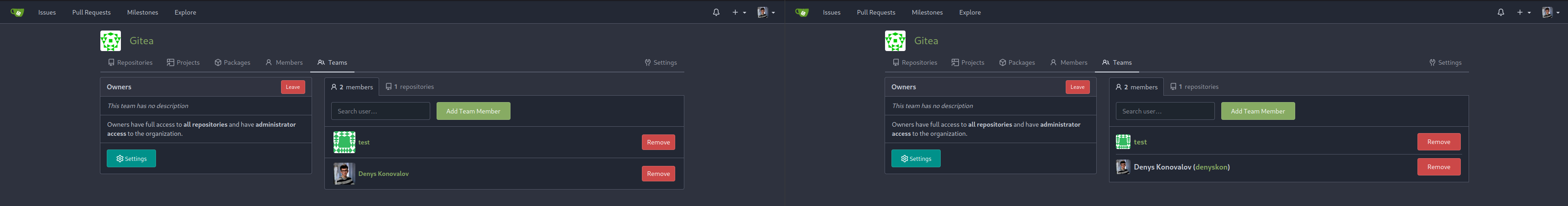
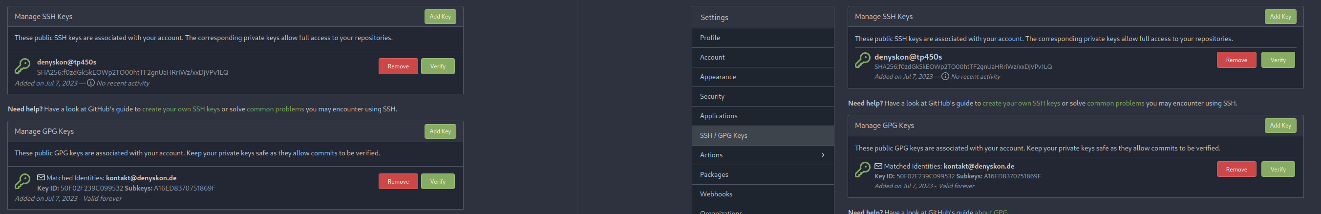
Denys Konovalov
5b5bb8d354
User details page ( #26713 )
...
This PR implements a proposal to clean up the admin users table by
moving some information out to a separate user details page (which also
displays some additional information).
Other changes:
- move edit user page from `/admin/users/{id}` to
`/admin/users/{id}/edit` -> `/admin/users/{id}` now shows the user
details page
- show if user is instance administrator as a label instead of a
separate column
- separate explore users template into a page- and a shared one, to make
it possible to use it on the user details page
- fix issue where there was no margin between alert message and
following content on admin pages
<details>
<summary>Screenshots</summary>


</details>
Partially resolves #25939
---------
Co-authored-by: Giteabot <teabot@gitea.io>
2023-08-31 11:21:18 +02:00
silverwind
3d109861dd
Render code blocks in repo description ( #26830 )
...
Backtick syntax now works in repo description too. Also, I replaced the
CSS for this was a new single class, making it more flexible and not
dependent on a parent. Also, very slightly reduced font size from 16.8px
to 16px.

---------

Co-authored-by: wxiaoguang <wxiaoguang@gmail.com>
2023-08-31 05:01:01 +00:00
wxiaoguang
19a1e1b20e
Remove polluted .ui.right ( #26825 )
...
Each change is tested manually line by line. There are too many changes
so I can't share dozens of screenshots.

In short:

1. `ui right` could be still used in `ui top attached header`, because
there is a special case.
2. A lot of `ui right` are just no-op, so they can be removed safely.
3. Some of the `ui right` should be replaced by `gt-float-right` (to
avoid breaking, leave them to the future).
4. A few of the `ui right` could be rewritten by flex.
2023-08-31 02:29:59 +00:00
wxiaoguang
1bb9b1c4d9
Remove polluted ".ui.left" style ( #26809 )
2023-08-30 21:46:24 +08:00
delvh
2590707122
Remove fomantic text module ( #26777 )
...
Corollary to #26775 :
All selectors I found that are actually used and not necessarily present
in the current code have been copied to `web_src/css/base.css`.
Everything else should be a clean removal.
2023-08-30 10:37:17 +00:00
wxiaoguang
1a9998ce91
Improve flex list item padding ( #26779 )
...
Replace #26761
It's better to keep children elements simple, and let parent containers
layout the necessary padding/margin.
The old `not(:last-child)` and `.flex-item + .flex-item` are not easy to
maintain (for example, what if the developer would like to use a "tiny
height" item?)
The old approach also makes some UI look strange because the first item
doesn't have proper padding-top.
In this PR, we just simply use `.flex-item { padding: ... }`:
* Developers could manually set the item height they want easily
* It's easier to make it work with various containers -- with padding
(`ui segment`) and without padding (`div`)
And added more samples/examples.

Co-authored-by: Giteabot <teabot@gitea.io>
2023-08-29 23:13:30 +00:00
wxiaoguang
96ba747ff2
Fix notification circle (border-radius) ( #26794 )
...
`border-radius` means `radius`, not `diameter`, so it should be `50%` and `boxHeight / 2`
2023-08-29 14:03:34 +00:00
wxiaoguang
0ab70d4f2f
Improve modal dialog UI ( #26764 )
...
1. Fine tune the CSS styles, and add more examples
2. Add necessary "dimmer" animation for modal dialogs, otherwise the UI
seems flicking (follow #26469 )
2023-08-28 23:49:21 +00:00
delvh
dca2f9371d
Unify border-radius behavior ( #26770 )
...
## Changes
- no more hardcoded `border-radius`es (apart from `0`)
- no more value inconsistencies
- no more guessing what pixel value you should use
- two new variables:
- `--border-radius-medium` (for elements where the normal border radius
does not suffice)
  - `--border-radius-circle` (for displaying circles)

---------

Co-authored-by: silverwind <me@silverwind.io>
2023-08-28 19:43:59 +00:00
wxiaoguang
4803766f7a
Refactor some CSS styles and simplify code ( #26771 )
...
Refactor some CSS styles and simplify code.

Some styles are not in use, remove them.
2023-08-28 22:14:51 +08:00
wxiaoguang
67daa7bcb0
Remove some transition related code ( #26755 )
...
Remove transition related code because the transition module has been
removed by #26469
2023-08-28 01:26:23 +00:00
puni9869
e0a796a641
Adding hint Archived to archive label. ( #26741 )
...
Followup https://github.com/go-gitea/gitea/pull/26478
## Archived labels UI
Changed:
* Enhanced the Filtered UI page to seamlessly incorporate a list of
archived labels.
Outsourced:
* Defer the implementation of specialized handling for archived labels
to upcoming pull requests. This step will be undertaken subsequent to
the successful merge of this pull request.
Screenshots


---
Part of https://github.com/go-gitea/gitea/issues/25237
---------
Co-authored-by: Giteabot <teabot@gitea.io>
Co-authored-by: silverwind <me@silverwind.io>
2023-08-27 09:32:54 +00:00
wxiaoguang
576644d815
Simplify helper CSS classes and avoid abuse ( #26728 )
...
Removed CSS helper classes (some of them are not useful while some of
them are abused often)
* `gt-db`: in most cases it could be replaced by `gt-df` and the flex
layout should be encouraged. Other cases: either it does need the
`gt-df` (eg: by using `div` directly) or it is an abuse (eg: the warning
message in a form)
* `gt-di`: it doesn't seem useful, or it could be replaced by `gt-dib`
in most cases.
* `gt-dif`: not useful, it could be replaced by `flex-text-inline` or
`gt-df`
* `gt-js`: never used
* All `<i class="icon gt-df gt-ac gt-jc">` could be written as `<i
class="icon">`
## Some UI samples
### Admin Notice
### Admin Stacktrace

### Org Home

### Org Team Repo

### Release List

### User Setting Application Token Scope

Co-authored-by: Giteabot <teabot@gitea.io>
2023-08-26 01:35:10 +02:00
silverwind
8b5c081d76
Remove fomantic loader module ( #26670 )
...
Replace Fomantic `loader` CSS module with our existing `is-loading`
spinner. Only three places in the UI used this module, which are
pictured here:
imagediff:
<img width="1237" alt="Screenshot 2023-08-22 at 22 18 01"
src="https://github.com/go-gitea/gitea/assets/115237/b0d82531-f05e-43c6-9e5b-1bfc268c056d ">
webauthn:
<img width="894" alt="Screenshot 2023-08-22 at 22 05 05"
src="https://github.com/go-gitea/gitea/assets/115237/7b583425-d944-474a-a57a-22a65bbd8b29 ">
heatmap (I removed the previous loading text, it was unreadable because
it was tiny and on fast machines only visible for a fraction of a
second):
<img width="764" alt="Screenshot 2023-08-22 at 22 18 44"
src="https://github.com/go-gitea/gitea/assets/115237/1c7472d6-3e17-4224-a992-d8c0b380cc73 ">
Also, heatmap container does not resize any more after loading now and
previous duplicate id `user-heatmap` is gone.
---------
Co-authored-by: wxiaoguang <wxiaoguang@gmail.com>
2023-08-25 16:03:14 +00:00
Viktor Suprun
7b05d66e60
Fixed text overflow in dropdown menu ( #26694 )
...
Fixes #26622
Co-authored-by: Giteabot <teabot@gitea.io>
2023-08-25 11:15:21 +00:00
wxiaoguang
ee9e83b230
Remove incorrect CSS helper classes ( #26712 )
2023-08-25 06:47:59 +00:00
wxiaoguang
390ec619f3
Fix review bar misalignment ( #26711 )
2023-08-24 23:46:30 +08:00
wxiaoguang
8ac83043f5
Use "small-loading-icon" insead of "btn-octicon is-loading" ( #26710 )
...
The "btn-octicon is-loading" was introduced by #21842 , it is only used
by the "Copy Content" button, but the "btn-octicon" selector would
affect too many uncertain elements.

Now there is a general "small-loading-icon" class, so the "btn-octicon
is-loading" could be removed.
2023-08-24 10:21:41 -04:00
wxiaoguang
09faf43ef8
Improve Image Diff UI ( #26696 )
...
1. Use `is-loading` instead of `ui loader`
2. Introduce class name `image-diff-tabs`, instead of searching `gt-hidden`, which is fragile
3. Align the UI elements, see the screenshots.
2023-08-24 12:13:23 +00:00
wxiaoguang
e4b2bdfbc0
More improvements for the "flex list" and the dashboard list ( #26675 )
...
Follow #26649 and #25790 and add one more example (text truncate) in the devtest page
2023-08-23 04:23:30 +00:00
wxiaoguang
8f2e2878e5
Use line-height: normal by default ( #26635 )
...
Fix #26537 again because 1.15 is too small for some fonts.
2023-08-22 10:19:15 +00:00
wxiaoguang
7934602a4c
Improve some flex layouts ( #26649 )
...
Fix #26617

1. Separate the "flex-list" examples into a dedicated template, and add some more examples
2. Use `flex-basis` instead of `flex-shrink` for `flex-item-trailing`, to avoid wrapping the texts too aggressively
3. Some `flex-wrap: wrap;` are removed
2023-08-22 12:57:02 +08:00
wxiaoguang
42cbe6005a
Improve the branch selector tab UI ( #26631 )
2023-08-21 13:35:02 +00:00
silverwind
facdaee47b
Replace box-shadow for floating dropdown as well ( #26581 )
...
Add `box-shadow` replacement to the `floating` dropdown variant as well,
which was missed in https://github.com/go-gitea/gitea/pull/26469 . The
Fomantic style has `!important`, so this has to have too. Also made a
tiny adjustment to shadow color on dark theme.
<img width="305" alt="Screenshot 2023-08-18 at 16 40 34"
src="https://github.com/go-gitea/gitea/assets/115237/a0aac9cb-6393-4d69-b0b3-00eaac5ccf9f ">
<img width="202" alt="Screenshot 2023-08-18 at 16 40 22"
src="https://github.com/go-gitea/gitea/assets/115237/0a5fa3aa-7452-4dbd-86ed-ccbc1c872ebb ">
Co-authored-by: Giteabot <teabot@gitea.io>
2023-08-21 12:49:49 +02:00
wxiaoguang
fe2b9274b1
Fix various line-height styles ( #26553 )
...
Fix #26537
Use the same default line-height as "normalize.css" instead of "1". "1"
is not right because it doesn't work with descent part and causes
overflow problems.

---------
Co-authored-by: silverwind <me@silverwind.io>
2023-08-17 21:50:32 +00:00
silverwind
376c0e25f7
Remove fomantic transition module ( #26469 )
...
Removes all dropdown and dimmer animations. Works everywhere as far as I
can tell, but need to give this thorough testing. Removes around 70kb
JS/CSS.

Note, I'm not 100% sure regarding the various callbacks, those will need
more investigation, but it appears to work nonetheless.

Fixes: https://github.com/go-gitea/gitea/issues/15709
2023-08-16 22:12:40 +00:00
silverwind
3e044d2c9f
Use unique class for breadcrumb divider ( #26524 )
...
Fix regression from https://github.com/go-gitea/gitea/pull/25539 :
https://github.com/go-gitea/gitea/pull/26519#issuecomment-1678825200 .
Before:
<img width="429" alt="Screenshot 2023-08-15 at 15 46 12"
src="https://github.com/go-gitea/gitea/assets/115237/a818f60a-77a2-48fe-8e6f-363d152ccb1e ">
After:
<img width="424" alt="Screenshot 2023-08-15 at 15 46 19"
src="https://github.com/go-gitea/gitea/assets/115237/c90159e2-ced2-4a74-8a0f-a1b2b5d0b565 ">
<img width="605" alt="Screenshot 2023-08-15 at 15 56 11"
src="https://github.com/go-gitea/gitea/assets/115237/3ded6f57-86f4-422a-86cb-56dd2c216dee ">
2023-08-16 00:08:23 +00:00
wxiaoguang
c7fd9ad8b4
Fix dark theme highlight for "NameNamespace" ( #26519 )
...
The color is taken from "Name"
Before:
After:

Co-authored-by: Giteabot <teabot@gitea.io>
2023-08-16 00:10:10 +02:00
silverwind
7563891cc4
Remove duplicate CSS import for chroma/base.css ( #26523 )
2023-08-16 05:13:56 +08:00
silverwind
27e4ac3e40
Use hidden over clip for text truncation ( #26520 )
...
Avoid browser bugs:

- Firefox not cutting off -
https://github.com/go-gitea/gitea/pull/26354#issuecomment-1678456052
- Safari not showing ellipsis -
https://github.com/go-gitea/gitea/pull/26354#issuecomment-1678812801
2023-08-15 13:23:51 +00:00
a1012112796
19872063a3
add disable workflow feature ( #26413 )
...
As title, that's simmilar with github.


---------
Signed-off-by: a1012112796 <1012112796@qq.com>
Co-authored-by: silverwind <me@silverwind.io>
Co-authored-by: Jason Song <i@wolfogre.com>
2023-08-14 15:14:30 +00:00
wxiaoguang
253737eb36
Move dropzone progress bar to bottom to show filename when uploading ( #26492 )
...
1. Make the "filename" visible
2. Avoiding UI flicker when the uploading is completing
2023-08-14 22:36:53 +08:00
Denys Konovalov
ab78c39e41
Refactor project templates ( #26448 )
...
This PR refactors a bunch of projects-related code, mostly the
templates.
The following things were done:
- rename boards to columns in frontend code
- use the new `ctx.Locale.Tr` method
- cleanup template, remove useless newlines, classes, comments
- merge org-/user and repo level project template together
- move "new column" button into project toolbar
- move issue card (shared by projects and pinned issues) to shared
template, remove useless duplicated styles
- add search function to projects (to make the layout more similar to
milestones list where it is inherited from 😆 )
- maybe more changes I forgot I've done 😆
Closes #24893
After:


---------
Co-authored-by: silverwind <me@silverwind.io>
2023-08-12 10:30:28 +00:00
yp05327
918d0f033d
Fix the display of orgs listed in user profile ( #26424 )
...
Before:

After:

In #26214 , we changed each row's display into `flex` which caused this
problem.


In old version:

Maybe we can add paddings here?

In old version;
2023-08-11 03:28:36 +08:00
Maxim Slipenko
c2b6897e35
Fix text truncate ( #26354 )
...
Fixes: https://github.com/go-gitea/gitea/issues/25597
Before:

After:
Co-authored-by: Giteabot <teabot@gitea.io>
2023-08-07 22:44:04 +02:00
Earl Warren
6ed4626ed5
Merge templates/projects/list.tmpl and templates/repo/projects/list.tmpl together ( #26265 )
...
(cherry picked from commit 473862a1d599382ca022482e2e044025872d240b)

Refs: https://codeberg.org/forgejo/forgejo/pulls/1126

Co-authored-by: Louis Seubert <louis.seubert.ls@gmail.com>
Co-authored-by: Giteabot <teabot@gitea.io>
2023-08-01 16:54:54 +00:00
Denys Konovalov
b9baed2c74
Introduce flex-list & flex-item elements for Gitea UI ( #25790 )
...
This PR introduces a new UI element type for Gitea called `flex-item`.
It consists of a horizontal card with a leading, main and trailing part:

The idea behind it is that in Gitea UI, we have many cases where we use
this kind of layout, but it is achieved in many different ways:
- grid layout
- `.ui.list` with additional hacky flexbox
- `.ui.key.list` - looks to me like a style set originally created for
ssh/gpg key list, was used in many other places
- `.issue.list` - created for issue cards, used in many other places
- ...
This new style is based on `.issue.list`, specifically the refactoring
of it done in #25750 .
In this PR, the new element is introduced and lots of templates are
being refactored to use that style. This allows to remove a lot of
page-specific css, makes many of the elements responsive or simply
provides a cleaner/better-looking way to present information.
A devtest section with the new style is also available.
<details>
<summary>Screenshots (left: before, right: after)</summary>


</details>
---------
Co-authored-by: Giteabot <teabot@gitea.io>
2023-08-01 00:13:42 +02:00
Panagiotis "Ivory" Vasilopoulos
d58c542579
Add 'Show on a map' button to Location in profile, fix layout ( #26214 )
...
Not too important, but I think that it'd be a pretty neat touch.

Also fixes some layout bugs introduced by a previous PR.

---------

Co-authored-by: Gusted <postmaster@gusted.xyz>
Co-authored-by: Caesar Schinas <caesar@caesarschinas.com>
Co-authored-by: wxiaoguang <wxiaoguang@gmail.com>
2023-07-31 08:44:45 +00:00
silverwind
7e160f8824
Reduce margins on user settings page, introduce flex-container ( #26046 )
...
Same as https://github.com/go-gitea/gitea/pull/26026 but for the user
settings page. It introduces a new `flex-container` class and shares it
across both pages.
Before and After:
<img width="1264" alt="Screenshot 2023-07-21 at 19 35 57"
src="https://github.com/go-gitea/gitea/assets/115237/1358dab4-55c0-40ce-a4d5-673099304f3d ">
<img width="1269" alt="Screenshot 2023-07-21 at 19 35 42"
src="https://github.com/go-gitea/gitea/assets/115237/34812f6d-dc65-4009-b977-90e03efdc6d1 ">
2023-07-31 07:16:03 +00:00
sebastian-sauer
55532061c8
Add commits dropdown in PR files view and allow commit by commit review ( #25528 )
...
This PR adds a new dropdown to select a commit or a commit range
(shift-click like github) of a Pull Request.
After selection of a commit only the changes of this commit will be shown.
When selecting a range of commits the diff of this range is shown.
This allows to review a PR commit by commit or by viewing only commit ranges.
The "Show changes since your last review" mechanism github uses is implemented, too.
When reviewing a single commit or a commit range the "Viewed" functionality is disabled.
## Screenshots
### The commit dropdown

### Selecting a commit range

### Show changes of a single commit only

### Show changes of a commit range

Fixes https://github.com/go-gitea/gitea/issues/20989
Fixes https://github.com/go-gitea/gitea/issues/19263
---------
Co-authored-by: silverwind <me@silverwind.io>
Co-authored-by: KN4CK3R <admin@oldschoolhack.me>
Co-authored-by: wxiaoguang <wxiaoguang@gmail.com>
Co-authored-by: delvh <dev.lh@web.de>
2023-07-28 21:18:12 +02:00
puni9869
1d8d90fd37
Fixing the align of commit stats in commit_page template. ( #26161 )
...
Fixing the align center to row and space around for commit_page
template.
2023-07-28 13:12:44 -04:00