Although it seems that some different purposes are mixed in this PR,
however, they are all related, and can be tested together, so I put them
together to save everyone's time.
Diff: `+79 −84`, everything becomes much better.
### Improve the dropdown settings.
Move all fomantic-init related code into our `fomantic.js`
Fine-tune some dropdown global settings, see the comments.
Also help to fix the first problem in #23625 , cc: @yp05327
The "language" menu has been simplified, and it works with small-height
window better.
### Use SVG instead of `<i class="delete icon">`
It's also done by `$.fn.dropdown.settings.templates.label` , cc:
@silverwind
### Remove incorrect `tabable` CSS class
It doesn't have CSS styles, and it was only in Vue. So it's totally
unnecessary, remove it by the way.
### Improve the Repo Topic Edit form
* Simplify the code
* Add a "Cancel" button
* Align elements
Before:
<details>

</details>
After:

Resolves#22692
I don't think there's a need for this entire row to be clickable (and
even different links depending on which segment you click)
The links still point to the same spot, so no information is lost here.
---------
Signed-off-by: jolheiser <john.olheiser@gmail.com>
Co-authored-by: wxiaoguang <wxiaoguang@gmail.com>
Follow:
* #23574
* Remove all ".tooltip[data-content=...]"

Major changes:

* Remove "tooltip" class, use "[data-tooltip-content=...]" instead of
".tooltip[data-content=...]"
* Remove legacy `data-position`, it's dead code since last Fomantic
Tooltip -> Tippy Tooltip refactoring
* Rename reaction attribute from `data-content` to
`data-reaction-content`
* Add comments for some `data-content`: `{{/* used by the form */}}`
* Remove empty "ui" class
* Use "text color" for SVG icons (a few)
Fixes#23645
* Added `describedby` attribute to the reference element.
* Eliminated `aria-expanded` attribute to the reference element in order
to conform strictly with WCAG 2.1 rules.
Remove `[repository.editor] PREVIEWABLE_FILE_MODES` setting that seemed
like it was intended to support this but did not work. Instead, whenever
viewing a file shows a preview, also have a Preview tab in the file
editor.

Add new `/markup` web and API endpoints with `comment`, `gfm`,
`markdown` and new `file` mode that uses a file path to determine the
renderer.

Remove `/markdown` web endpoint but keep the API for backwards and
GitHub compatibility.

## ⚠️ BREAKING ⚠️

The `[repository.editor] PREVIEWABLE_FILE_MODES` setting was removed.
This setting served no practical purpose and was not working correctly.
Instead a preview tab is always shown in the file editor when supported.

---------

Co-authored-by: zeripath <art27@cantab.net>
Co-authored-by: Lunny Xiao <xiaolunwen@gmail.com>
## TLDR

* Improve performance: lazy creating the tippy instances.
* Transparently support all "tooltip" elements, no need to call
`initTooltip` again and again.
* Fix a temporary tooltip re-entrance bug, which causes showing temp
content forever.
* Upgrade vue3-calendar-heatmap to 2.0.2 with lazy tippy init
(initHeatmap time decreases from 100ms to 50ms)

## Details

### The performance

Creating a lot of tippy tooltip instances is expensive. This PR doesn't
create all tippy tooltip instances, instead, it only adds "mouseover"
event listener to necessary elements, and then switches to the tippy
tooltip

### The general approach for all tooltips

Before, dynamically generated tooltips need to be called with
`initTooltip`.

After, use MutationObserver to:

* Attach the event listeners to newly created tooltip elements, work for
Vue (easier than before)
* Catch changed attributes and update the tooltip content (better than
before)

It does help a lot, eg:

1a4efa0ee9/web_src/js/components/PullRequestMergeForm.vue (L33-L36)

### Temporary tooltip re-entrance bug

To reproduce, on try.gitea.io, click the "copy clone url" quickly, then
the tooltip will be "Copied!" forever.

After this PR, with the help of `attachTippyTooltip`, the tooltip
content could be reset to the default correctly.

### Other changes

* `data-tooltip-content` is preferred from now on, the old
`data-content` may cause conflicts with other modules.
* `data-placement` was only used for tooltip, so it's renamed to
`data-tooltip-placement`, and removed from `createTippy`.
This PR follows #22599 and #23450

The major improvements:

1. The `aria-*.js` are totally transparent now, no need to call
`attachDropdownAria` explicitly anymore.
* It hooks the `$.fn.checkbox` and `$.fn.dropdown`, then our patch
works.
* It makes all dynamically generated checkbox/dropdown work with a11y
without any change
* eg: the `conversation.find('.dropdown').dropdown();` in `repo-diff.js`
2. Since it's totally transparent now, it could be easier to modify or
remove in the future.
3. It handles all selection labels as well (by onLabelCreate), so it
supports "multiple selection dropdown" now.
* It partially completes one of my TODOs: `TODO: multiple selection is
not supported yet.`
4. The code structure is clearer, code blocks are splitted into
different functions.
* The old `attachOneDropdownAria` was splitted into separate functions.
* It makes it easier to add more fine tunes in the future, and co-work
with contributors.
6. The code logic is similar as before, only two new parts:
    1. the `ariaCheckboxFn` and `ariaDropdownFn` functions
    2. the `onLabelCreate` and `updateSelectionLabel` functions

In `aria-dropdown.js` I had to mix jQuery and Vanilla JS somewhat, I
think the code is still understandable, otherwise the code would be much
more complex to read.

Thanks to fsologureng for the idea about "improving the 'delete icon'
with aria attributes".

If there is anything unclear or incorrect, feel free to ask and discuss,
or propose new PRs for it.
Related: #23590

Reference:
https://github.com/webcomponents/polyfills/tree/master/packages/webcomponentsjs

It seems that there are some users using old browsers, so the
`window.customElements` need polyfill.

The Custom Elements would help a lot for Gitea's UI problems, including:

* `<span class="js-pretty-number">`
* `<time data-format>`

So it's worth get polyfill.

---------

Co-authored-by: delvh <dev.lh@web.de>
1. The "close" inside "modal" are likely broken for long time
    * There is no var called `--body-color`
    * There is no `fullscreen modal`
* The `.ui.modal > .close.inside` doesn't seem to match most icons. It
only matches a few like "fork-repo-modal" or "adopt repo". Other places
are just buggy code copied again and again.
2. Convert the legacy `&:hover` LESS syntax to CSS syntax
This PR is extracted from #23346 to address some unclear (I don't
understand) code-belonging concerns.

This PR needs to be backported, otherwise the `aria.js` is too buggy in
some cases. Since there would be two minor conflicts, I will do the
backport manually.

Before: the `aria.js` is still buggy in some cases.

After: tested with AppleVoice, Android TalkBack

* Fix incorrect dropdown init code
* Fix incorrect role element (the menu role should be on the `$menu`
element, but not on the `$focusable`)
* Fix the focus-show-click-hide problem on mobile. Now the language menu
works as expected
* Fix incorrect dropdown template function setting
* Clarify the logic in aria.js
* Hide item's tippy after menu gets hidden
* Fix incorrect tippy `setProps` after `destroy`
* Fix UI lag problem when page gets redirected during menu hiding
animation with screen reader
* Improve comments
* Implement the layout proposed by #19861

<details>


d74a7efb60/web_src/js/features/aria.md (L38-L47)

</details>
Fix regression from https://github.com/go-gitea/gitea/pull/23481.

The conditional on the CSS import was being stripped away by webpack's
`css-loader`, resulting in the dark theme always loading. The old syntax
with `@import` nested inside `@media` also did not work as `css-loader`
(rightfully) ignores such non-standard `@import` syntax that was
previously supported by Less.

Unfortunately, we have to re-introduce postcss to the CSS pipeline to
fix this and I loaded only the minimal plugins to make it work.

There is one variant of the fix that does work without postcss, which is
to exclude the file from transpilation but I did not consider it as it
would have meant the `@import` was being done without a version suffix
in the URL, which would have caused cache issue.

Related: https://github.com/webpack-contrib/css-loader/issues/1503

---------

Co-authored-by: John Olheiser <john.olheiser@gmail.com>
Ran most of the Less files through the Less compiler and Prettier and
then followed up with a round of manual fixes.

The Less compiler had unfortunately stripped all `//` style comments
that I had to restore (It did preserve `/* */` comments). Other fixes
include duplicate selector removal which were revealed after the
transpilation and which weren't caught by stylelint before but now are.

Fixes: https://github.com/go-gitea/gitea/issues/15565
Follow #23394
There were many bad smells in old code. This PR only moves the code into
Vue SFC, doesn't touch the unrelated logic.
update: after
5f23218c85
, there should be no usage of the vue-rumtime-compiler anymore
(hopefully), so I think this PR could close#19851
---------
Co-authored-by: Lunny Xiao <xiaolunwen@gmail.com>
This improves a lot of accessibility shortcomings.
Every possible instance of `<div class="button">` matching the command
`ag '<[^ab].*?class=.*?[" ]button[ "]' templates/ | grep -v 'dropdown'`
has been converted when possible.
divs with the `dropdown` class and their children were omitted as
1. more analysis must be conducted whether the dropdowns still work as
intended when they are a `button` instead of a `div`.
2. most dropdowns have `div`s as children. The HTML standard disallows
`div`s inside `button`s.
3. When a dropdown child that's part of the displayed text content is
converted to a `button`, the dropdown can be focused twice

Further changes include that all "gitea-managed" buttons with JS code
received an `e.preventDefault()` so that they don't accidentally submit
an underlying form, which would execute instead of cancel the action.
Lastly, some minor issues were fixed as well during the refactoring.

## Future improvements

As mentioned in
https://github.com/go-gitea/gitea/pull/23337#discussion_r1127277391,
`<a>`s without `href` attribute are not focusable.
They should later on be converted to `<button>`s.

---------

Co-authored-by: wxiaoguang <wxiaoguang@gmail.com>
Co-authored-by: silverwind <me@silverwind.io>
Co-authored-by: techknowlogick <techknowlogick@gitea.io>
Co-authored-by: Lunny Xiao <xiaolunwen@gmail.com>
* Fix scoped label left and right part breaking across lines.
* Remove slanted divider in scoped label display, make it straight.
After using this for a while, this feels more visually noisy than
helpful.
* Reduce contrast between scope and item to reduce probability of
unreadable text on background.
* Change documentation to remove mention of non-exclusive scoped labels.

Co-authored-by: Lunny Xiao <xiaolunwen@gmail.com>
In #22767, we changed the class of `Edit Column` button from `red` to
`primary`
But `red` is used to find this button in js.....

---------

Co-authored-by: techknowlogick <techknowlogick@gitea.io>
Co-authored-by: zeripath <art27@cantab.net>
Follow:
* #23345
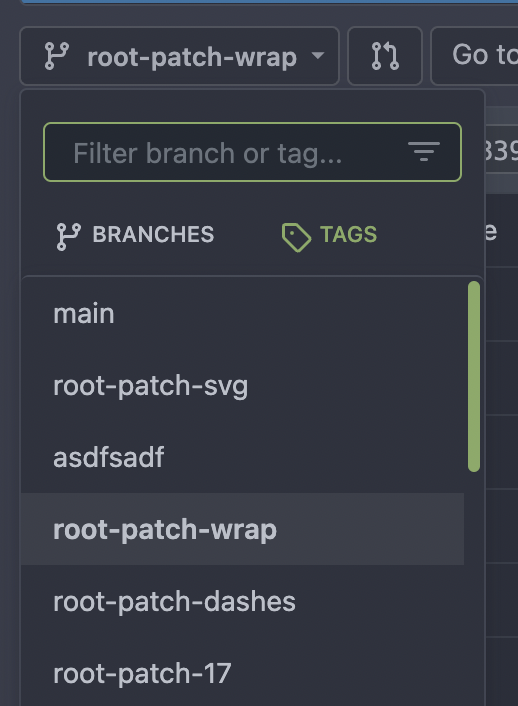
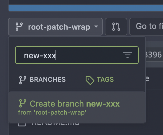
The branch/tag selector dropdown mixes jQuery/Fomantic UI/Vue together,
it's very diffcult to maintain and causes unfixable a11y problems. It
also causes problems like #19851#21314#21952
This PR is the first step for the refactoring, move `data-` attributes
to JS object and use Vue data as much as possible.
The old selector `'.choose.reference .dropdown'` was also wrong, it hits
`<div class="choose reference"><svg class="dropdown icon">` and would
cause undefined behaviors.
I have done some quick tests and it works. After this PR gets merged, I
will move the code into a Vue SFC in next PR.


---------
Co-authored-by: techknowlogick <techknowlogick@gitea.io>
The CSS styles in Gitea themes are out-of-sync of Chroma's styles.
This PR introduces a `chroma-style-diff.go` tool to compare the diff.
The missing CSS styles have been added manually. They are left as empty
to reduce arguments because there was no color for them before.
And this PR fixes#22348, with just 2 lines changed: `.chroma .kt & .n`,
these colors are taken from GitHub.
It's good enough for #22348

---------
Co-authored-by: silverwind <me@silverwind.io>
Replace #23342

Fix a regression of #23014: the `a` couldn't be used here because
Fomantic UI has style conflicts: `.ui.comments .comment .actions a {
display: inline-block; }`


And complete one more of my TODOs: "in the future there could be a
special CSS class for it"
Alt doesn't work on all browsers, the simplest solution for v1.19 is to
just not require it and toggle the label by just clicking.

Part of #22974

Co-authored-by: Lauris BH <lauris@nix.lv>
Co-authored-by: Lunny Xiao <xiaolunwen@gmail.com>
Close#23073.
Used the solution as reference to the reply:
https://github.com/go-gitea/gitea/issues/23073#issuecomment-1440124609
Here made the change inside the `contextpopup.js` because this is where
the popup component is created and tippy configuration is given.
Co-authored-by: Lunny Xiao <xiaolunwen@gmail.com>
### The CustomEvent prefix

There was already `ce-quick-submit`, the `ce-` prefix seems better than
`us-`. Rename the only `us-` prefixed `us-load-context-popup` to `ce-`
prefixed.

### Styles and Attributes in Go HTML Template

https://github.com/go-gitea/gitea/pull/21855#issuecomment-1429643073

Suggest to stick to `class="c1 {{if $var}}c2{{end}}"`

The readability and maintainability should be applied to the code which
is read by developers, but not for the generated outputs.

The template code is the code for developers, while the generated HTML
are only for browsers.

The `class="c1 {{if $var}}c2{{end}}"` style is clearer for developers
and more intuitive, and the generated HTML also makes browsers happy (a
few spaces do not affect anything)

Think about a more complex case:

* `class="{{if $active}}active{{end}} menu item {{if $show}}show{{end}}
{{if $warn}}warn{{end}}"`
* --vs--
* `class="{{if $active}}active {{end}}menu item{{if $show}}
show{{end}}{{if $warn}} warn{{end}}"`

The first style make it clearer to see each CSS class name with its
`{{if}}` block.

Co-authored-by: Lunny Xiao <xiaolunwen@gmail.com>